Fintech Portal: Enterprise Platform Redesign
A full redesign of a B2B enterprise platform used by financial institutions to onboard clients, track cross-border transactions, and manage user permissions.
Impact
What Changed After Launch
After launch, the redesign was adopted by all five product lines. Feedback from operations and product teams came back on two things consistently: speed and a shorter learning curve.
Finding a client used to mean scrolling through the whole list. Now I search and filter directly. It's much faster to get to what I need.
Operations TeamThe new flow is noticeably easier to get up to speed with. We spend much less time walking new team members through the portal.
Internal StakeholderThe component patterns were solid enough that we reused them across every other product line. It saved us significant time on subsequent builds.
Engineering TeamClient Record Lookup Time
Search and filter replaced manual list scanning for ops teams running this workflow dozens of times daily.
Product Lines Adopted
GMT, ISP, ISBO, COR, and RBA all adopted the component library and interaction patterns from this redesign.
Platform Reach
Countries served by the platform, with up to 300 institutions managed within a single product line.
The platform serves as the operational backbone for enterprise financial services across 130+ countries, supporting institutional clients managing products including GMT, ISP, ISBO, COR, and RBA. At its largest scale, a single product line manages relationships with up to 300 institutions, each operating under distinct product configurations and permission hierarchies.
As the platform expanded across markets and product lines, the interface had not kept pace. The portal was cluttered and inconsistent, creating usability problems and slowing teams down. The redesign addressed flow clarity, accessibility, and visual consistency across all four modules: navigation architecture, client setup, transaction dashboard, and user access control.
The focus throughout was on making complex, time-sensitive workflows faster and less error-prone for internal teams.
All visuals and details have been anonymized to comply with NDA, but the design logic, structure, and challenges reflect the actual work delivered.
This redesign was self-initiated. I proposed the project scope to leadership, drove the effort end-to-end from discovery through delivery, and ran design reviews with cross-functional stakeholders across product and engineering.
The biggest pushback came from engineering during the client setup redesign. The original flow required ops teams to manually scan an unfiltered list to locate a client before taking any action. I proposed replacing this with a searchable, filterable table and made the case to engineering that the rebuild was worth the effort. After launch, the time to locate and edit a client record dropped from around two minutes to under 30 seconds. Internal feedback consistently noted the new flow was faster to learn and easier to use.
The legacy portal had usability problems across three main pages: the Client Setup Page, Transaction Dashboard Page, and User Access Control Page. Each had distinct issues, but all of them slowed users down and eroded trust in the interface.
Section 01
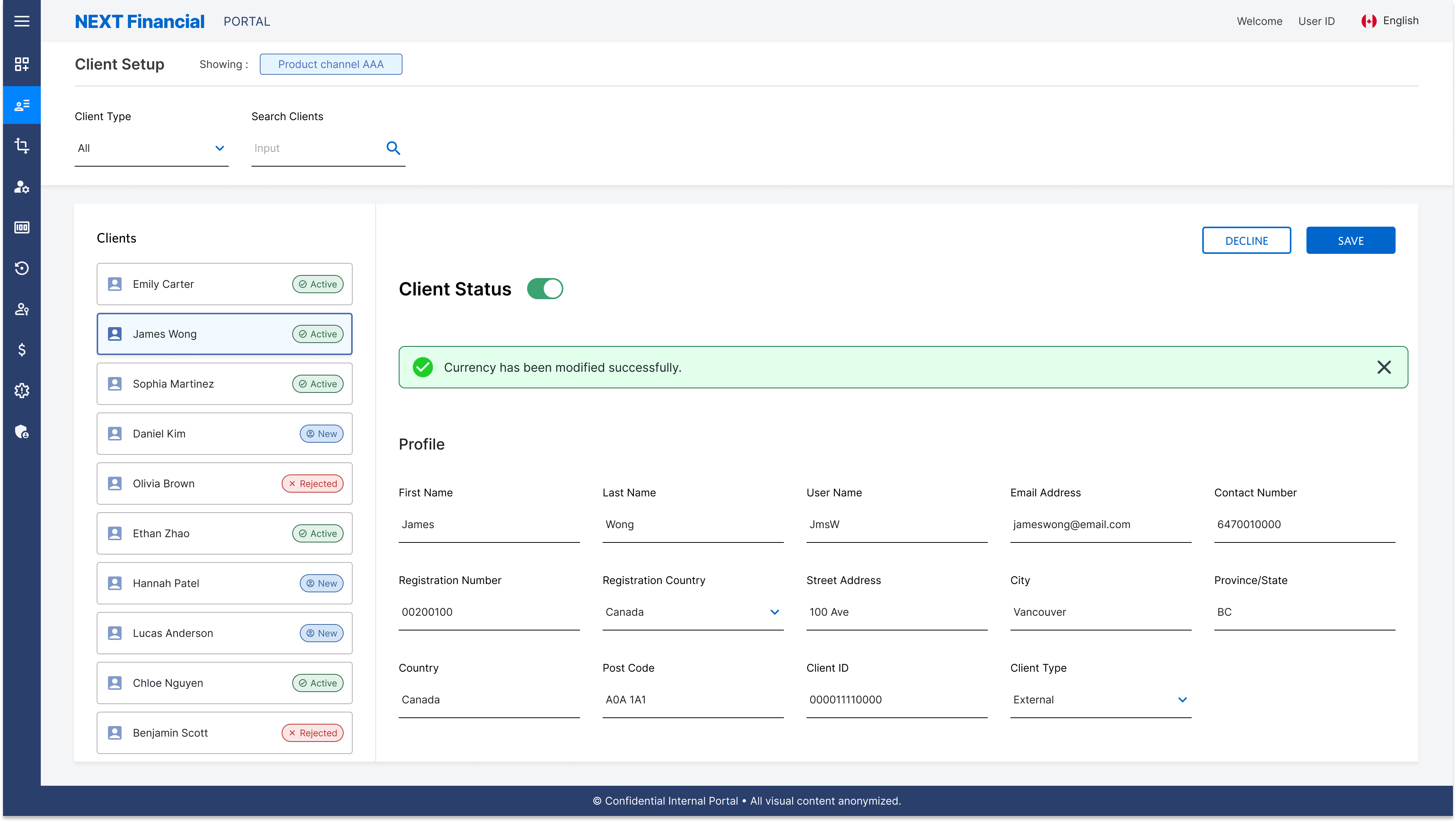
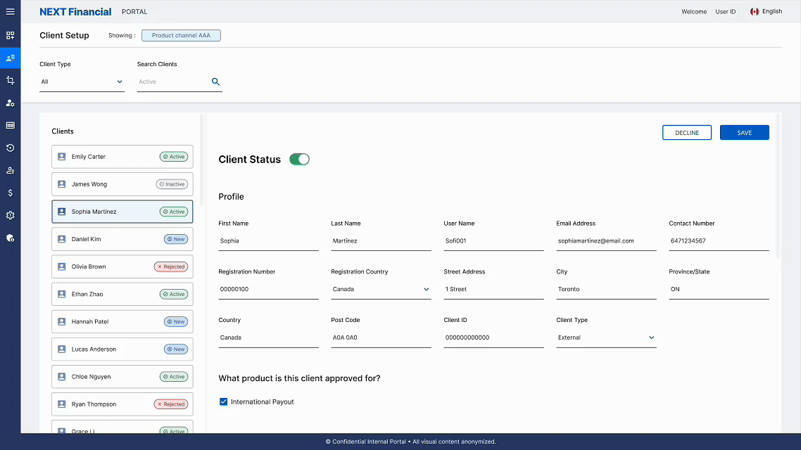
Client Setup Page
🔁 Userflow
The client setup (onboarding) flow begins with a secure login, allowing business users to access the portal and manage client records directly.
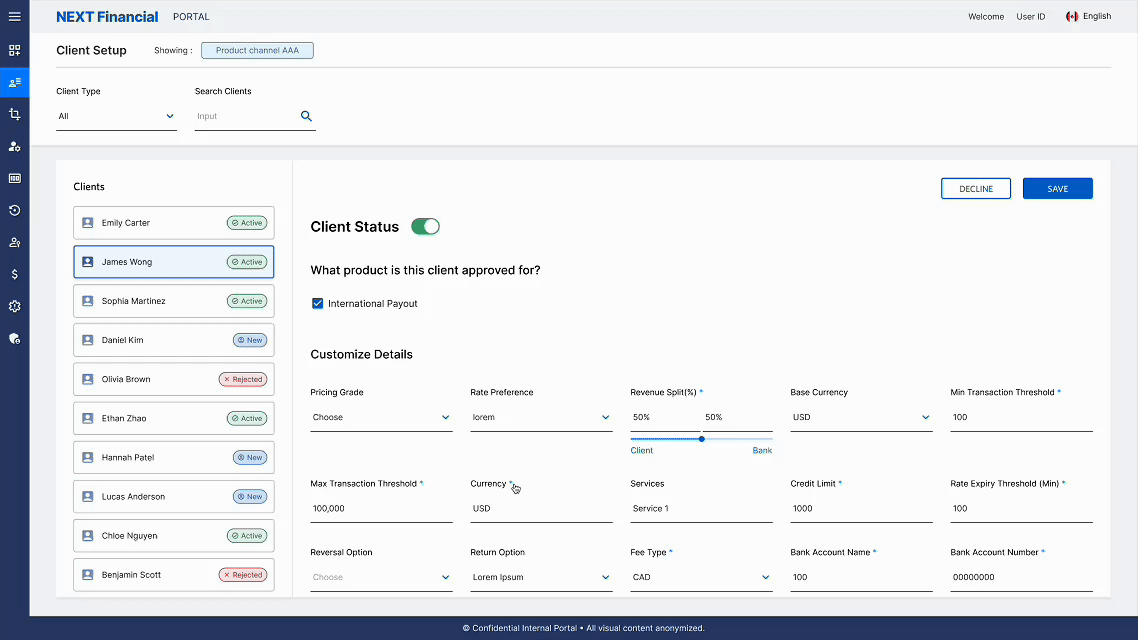
Users can view information about existing, new, rejected, and deactivated clients, with clear actions available to edit details, add new records, or reinstate accounts. Each action is supported by confirmation messages and a refreshed view, while errors are surfaced clearly to guide users back on track.
⚠️ Pain Points
The original client setup page had poor navigation, hidden data, and visual inconsistency that slowed onboarding workflows for all users.
No clear navigation hierarchy: Users cannot quickly locate client records or key actions
Critical data hidden behind tooltips: Extra interaction required to view essential details
Inconsistent visual language: Mixed colours, typography, and icons weaken brand clarity
Cluttered layout with no breathing room: Dense information makes scanning slow and error-prone
🛠️ Solution
The redesign introduced structured layouts, colour-coded status indicators, and guided validation to make client management faster and more intuitive.
Structured sections surface key details: No hidden tooltips or extra steps needed
Colour-coded status labels: Instant recognition of client states at a glance
Search and filters replace manual scrolling: Fewer steps and faster access across the platform
Consistent typography, spacing, and button hierarchy: Applied across all modules to reduce visual noise
Inline validation & confirmation modals: Fewer errors and greater confidence on critical actions
Side Navigation Redesign
Restructured side nav with clear hierarchy, grouped menu items, and consistent active and hover states to reduce navigation time across the portal.
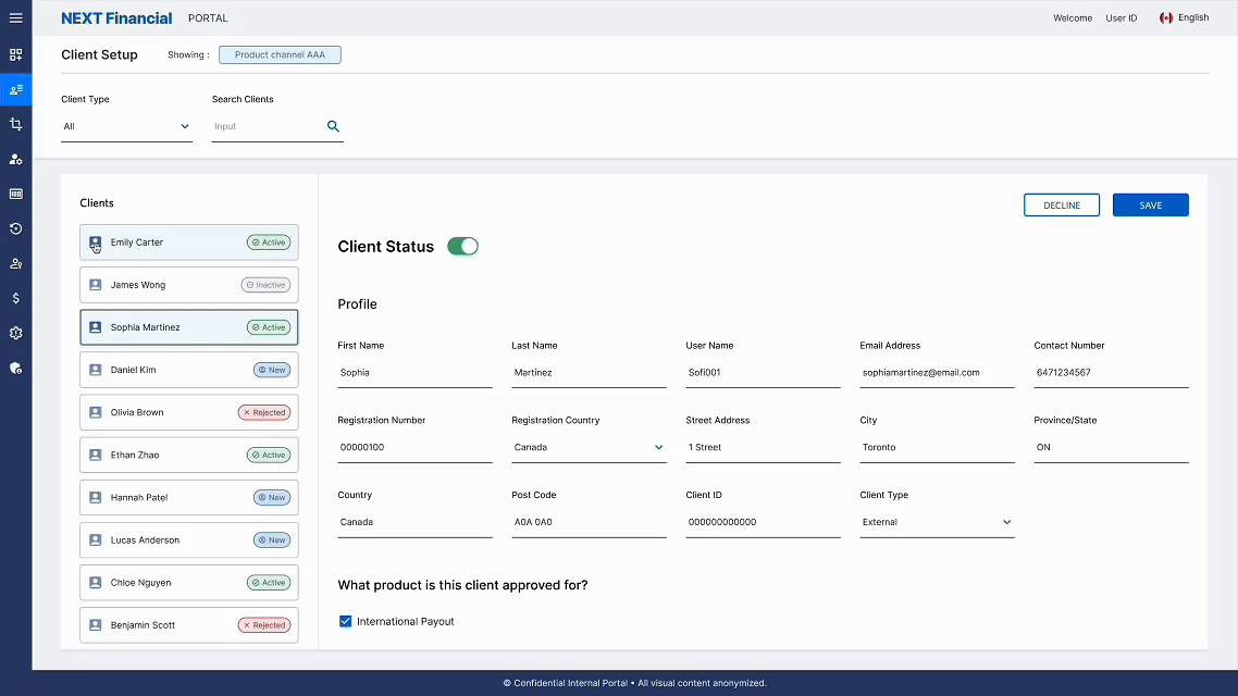
Search & Filter
Real-time search and multi-criteria filtering lets users quickly locate client records without scrolling through dense data tables.
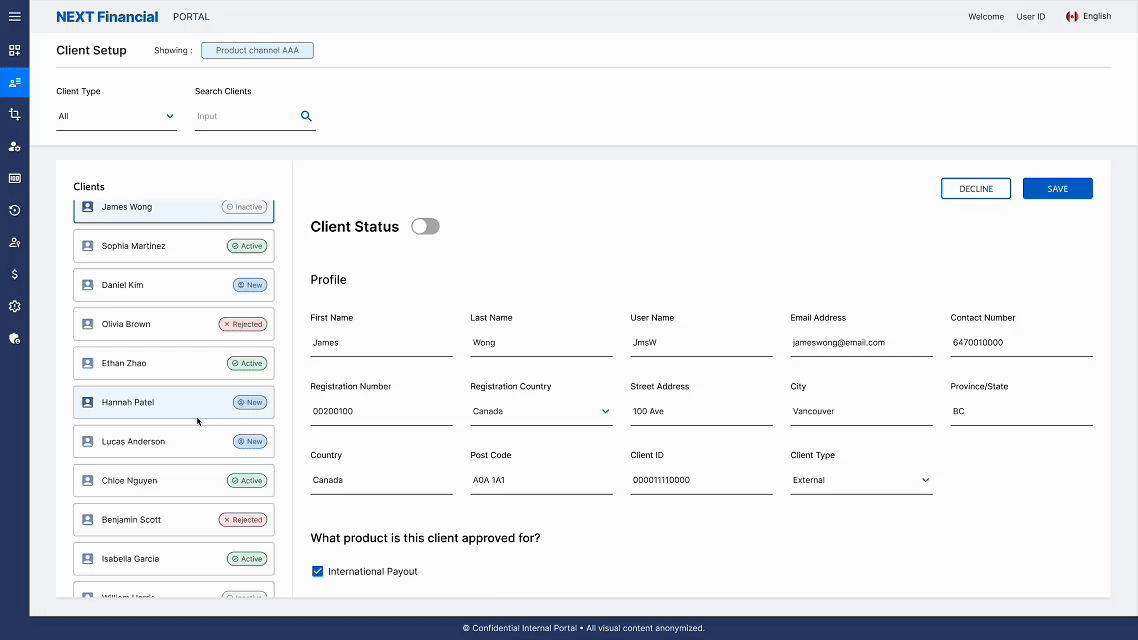
Status Toggle & Input Field Error
Inline toggle controls update client status instantly, while real-time validation surfaces field errors at the point of entry to prevent incomplete submissions.
Modal & Message Bar
Confirmation modals prevent accidental destructive actions, while persistent message bars provide immediate feedback on the outcome of key operations.
Section 02
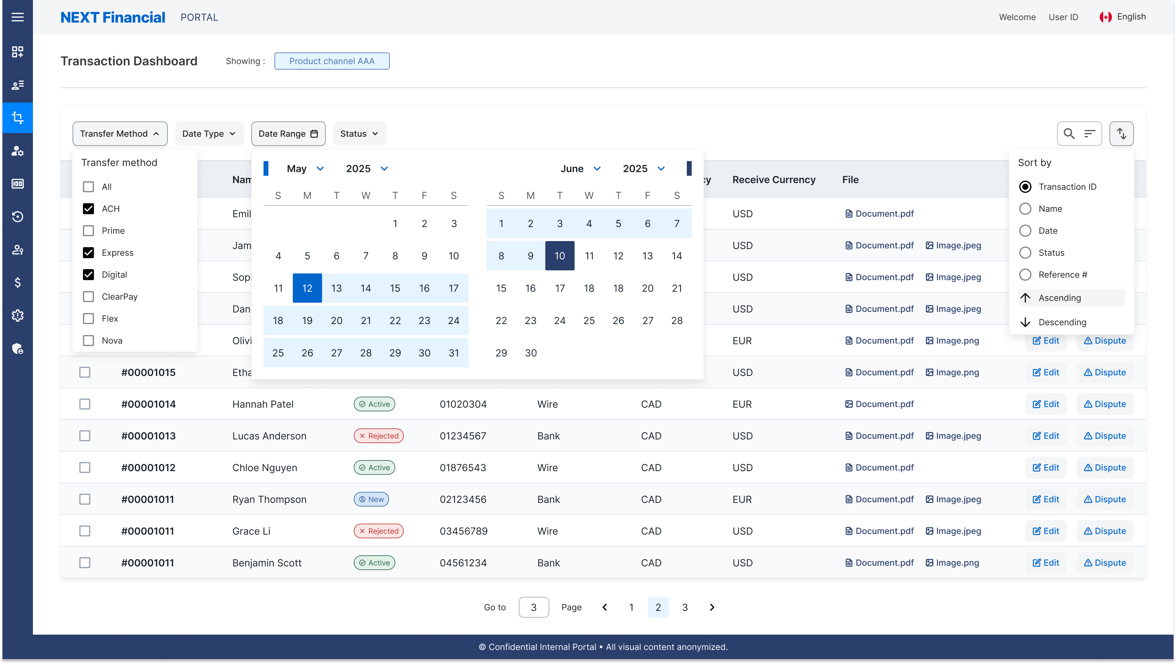
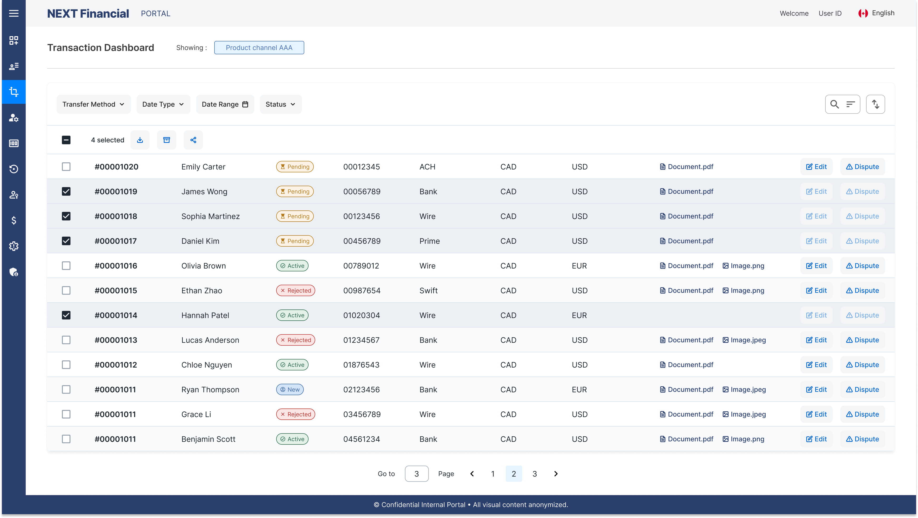
Transaction Dashboard Page
🔁 Userflow
The transaction dashboard flow provides business users with a path to review, edit, or dispute client transactions.
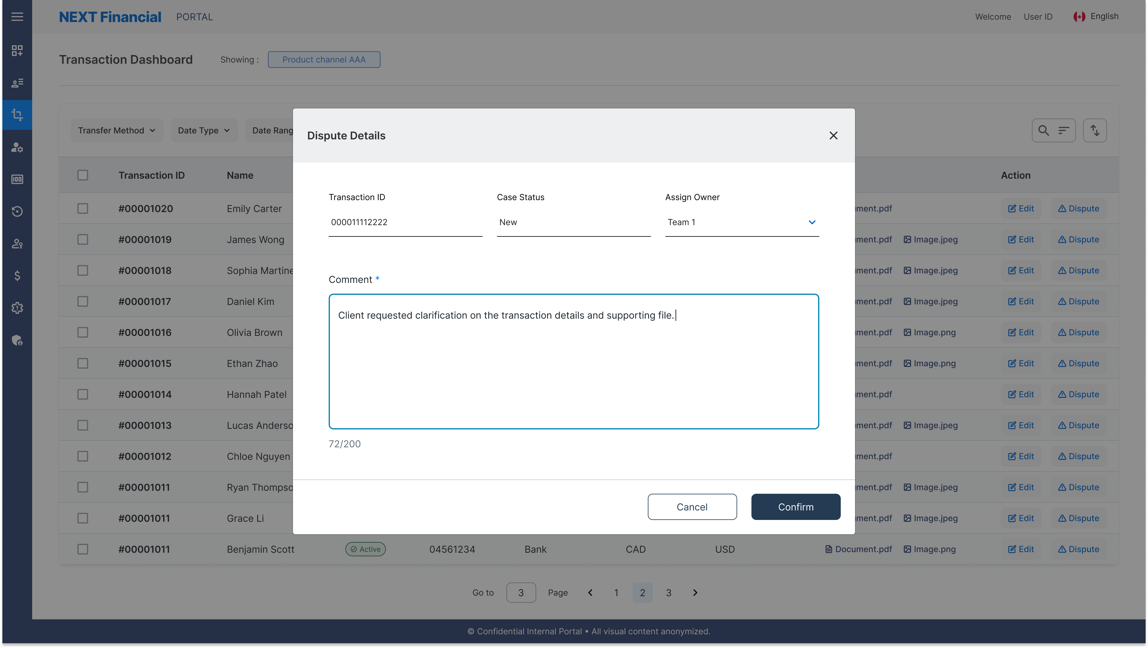
After a secure login, users access the dashboard connected to the transaction database table, where they can select a record to either view and edit details or raise a dispute. The dispute path requires a comment before submission, so there's always context attached when it reaches the resolution team. Successful actions trigger a confirmation message and refresh the dashboard state. Errors (invalid input or system issues) surface with clear guidance so users can retry or return without losing progress.
⚠️ Pain Points
The legacy dashboard prioritised data density over usability, creating friction at every step for teams managing high volumes of transactions.
Dense tables with no visual hierarchy: Difficult to scan large volumes of transaction data
Small interactive targets: Accessibility issues for all user types across devices
Ambiguous labels & abbreviations: "Case Status", "N/A", "USD" cause frequent confusion
Mandatory horizontal scrolling: Added friction on every routine task for frequent users
No quick filters or saved views: Workflows slowed significantly for high-volume users
🛠️ Solution
The redesign replaced rigid legacy patterns with a scalable, filterable dashboard built for efficiency and clarity at scale.
Scalable table with filtering, sorting & pagination: Large datasets stay easy to navigate
Multi-select enables bulk actions: Reduces repetitive effort across multiple records
Row-level interactions: Cell editing links directly to the client detail view
Standardised status badges: Transaction states are immediately readable without decoding labels or abbreviations
Filter & Search
Multi-criteria filters and keyword search let users narrow large transaction datasets by date, status, amount, or client without leaving the dashboard view.
Pagination & Archive
Paginated table navigation keeps large datasets manageable, with archiving controls to move resolved records out of the active view without permanent deletion.
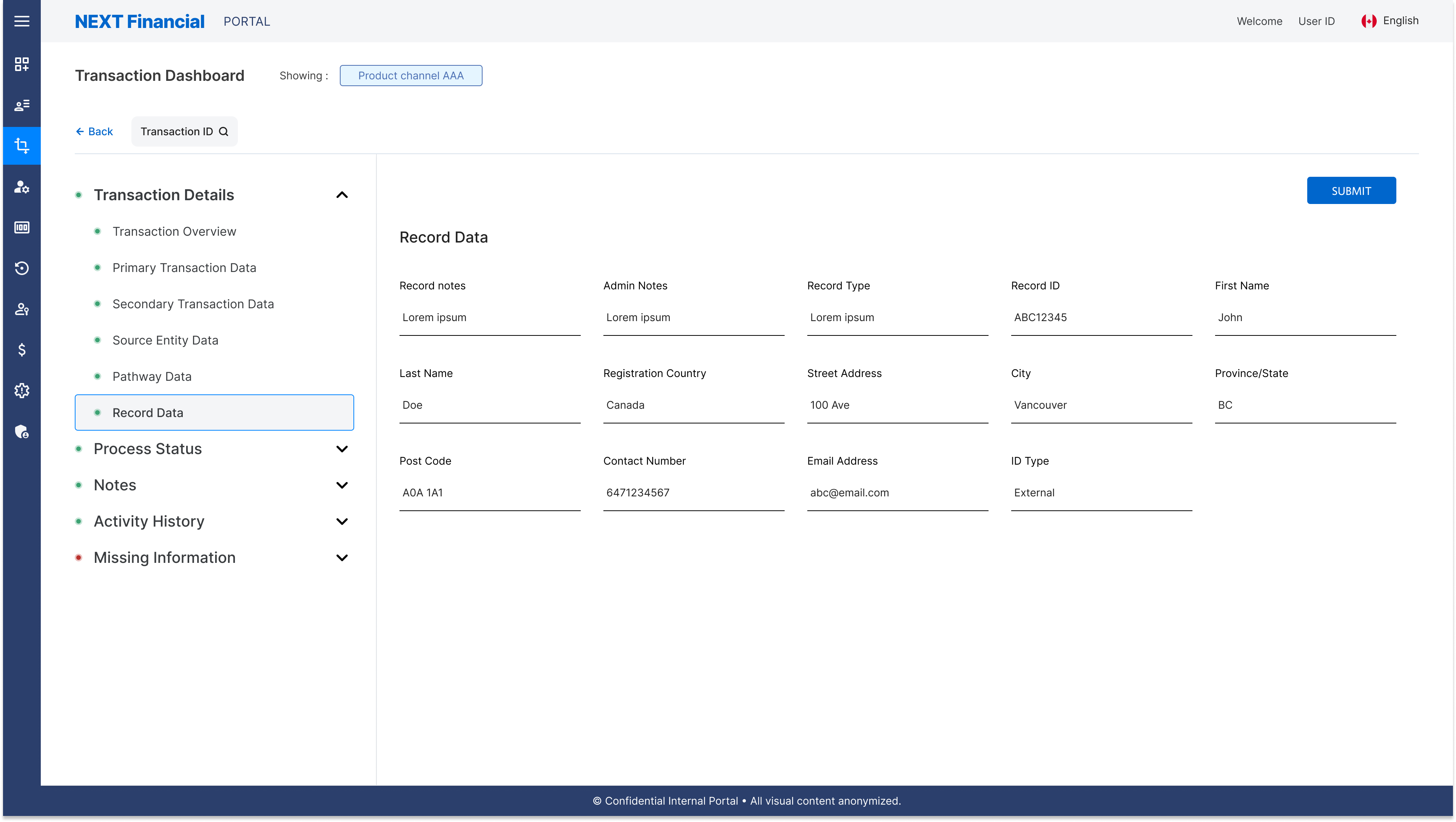
Edit Cell Details Page
Selecting a transaction row opens a structured detail panel where users can update records inline, with changes reviewed and confirmed before writing to the database.
Dispute Interaction
A guided flow requires users to add context before submitting a dispute, ensuring complete information is captured and reducing incomplete or erroneous requests.
Section 03
User Access Control Page
🔁 Userflow
The user access control flow enables business users with the permissions to manage account roles within the portal.
After logging in, users can view the list of existing accounts and choose to edit details, remove users, or add new ones. Editing updates a user's role or information and confirms changes with a notification and refreshed list. Removing a user requires confirmation before the database is updated. Adding a new user involves completing the required fields and submitting them, after which a success message appears and the new account is displayed. Errors from invalid input or system issues surface with clear guidance so users can retry without losing their place.
⚠️ Pain Points
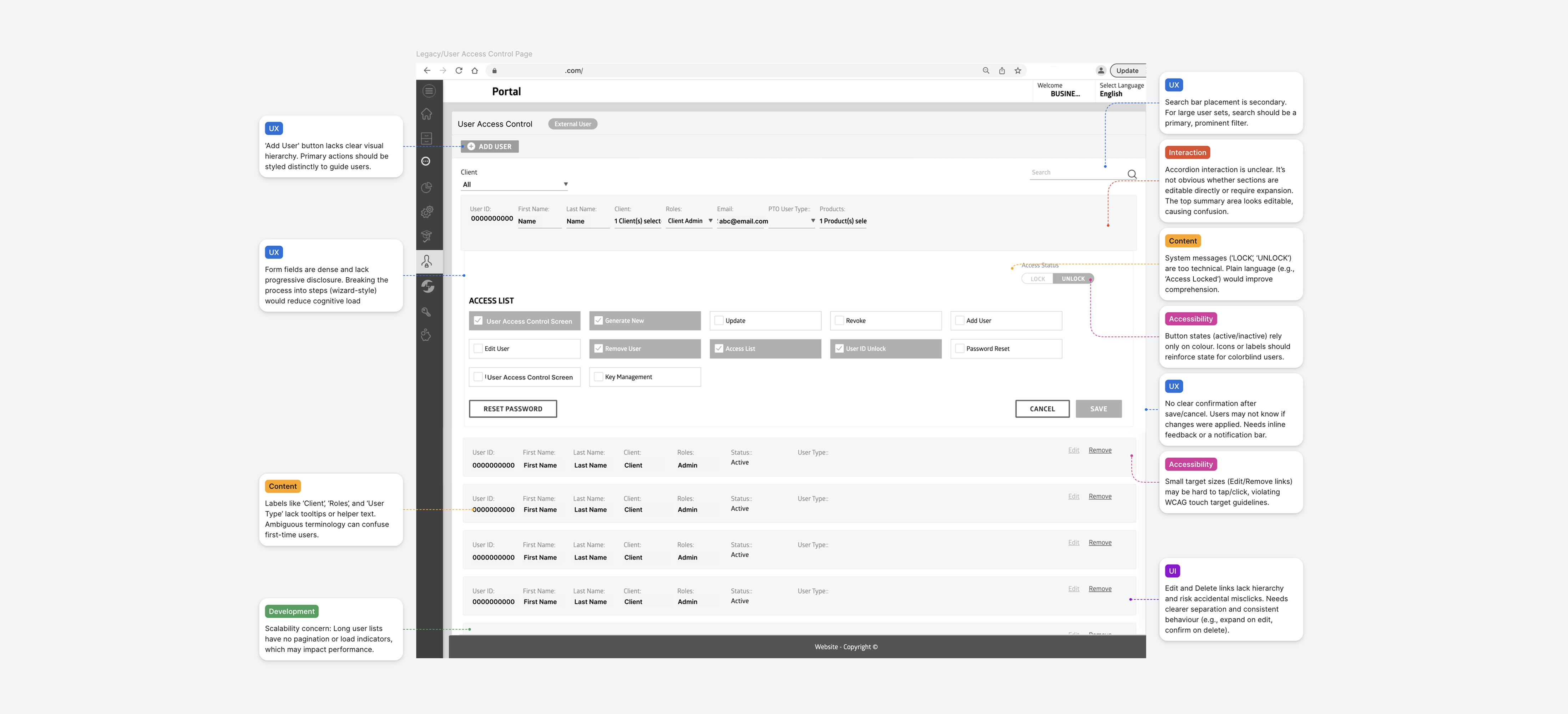
The legacy access control page buried critical actions in a dense, inaccessible layout that confused first-time users and created avoidable errors.
"Add User" CTA lacks visual prominence: Critical action is easily overlooked in the layout
Dense form fields with no progressive disclosure: Cognitive overload from the very first view
Ambiguous field labels: "Client", "Roles", "User Type" consistently confuse first-time users
Colour-only state indicators: Inaccessible for colour-blind users without additional context
Small edit & delete targets: High risk of accidental destructive actions at small sizes
🛠️ Solution
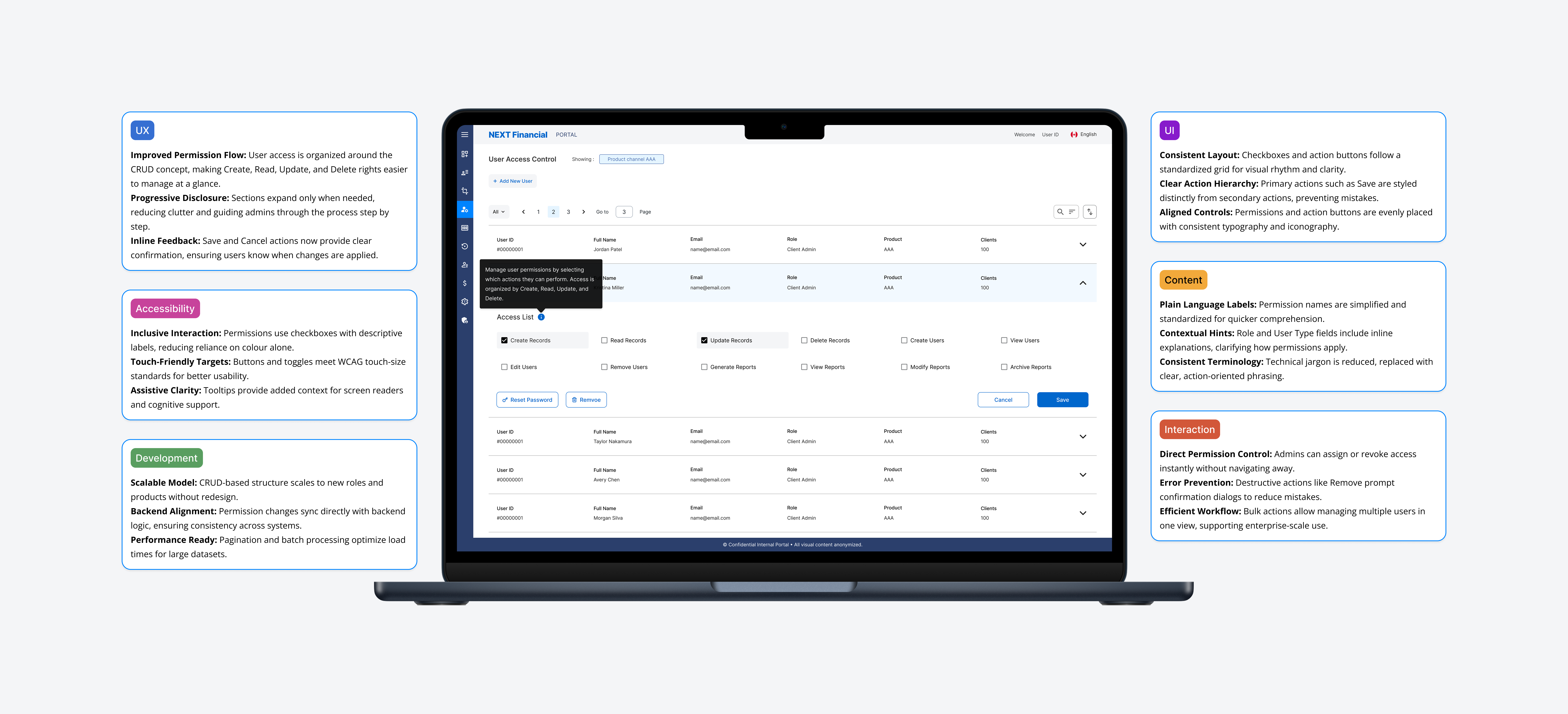
The redesign organised permissions around a CRUD framework with accessible controls, progressive disclosure, and explicit confirmation on destructive actions.
CRUD-based structure: Clear action hierarchy for assigning and reviewing user roles and permissions
Checkboxes replace hidden controls: Fully accessible without relying on colour alone
Progressive disclosure: Sections expand only when needed, reducing cognitive load throughout
Inline tooltips & contextual hints: Clarity delivered without cluttering the interface
Confirmation prompts for destructive actions: Prevents accidental user removal with clear safety steps

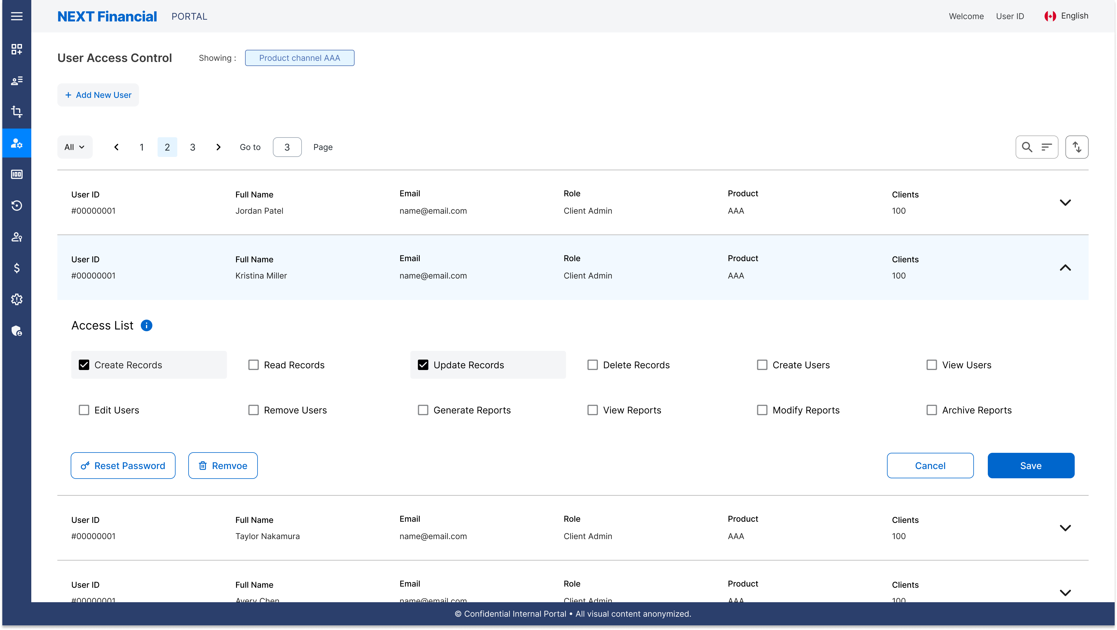
Edit Accordion
Expandable accordion panels reveal user detail fields on demand, reducing cognitive load and allowing inline edits to roles and permissions without a full-page redirect.

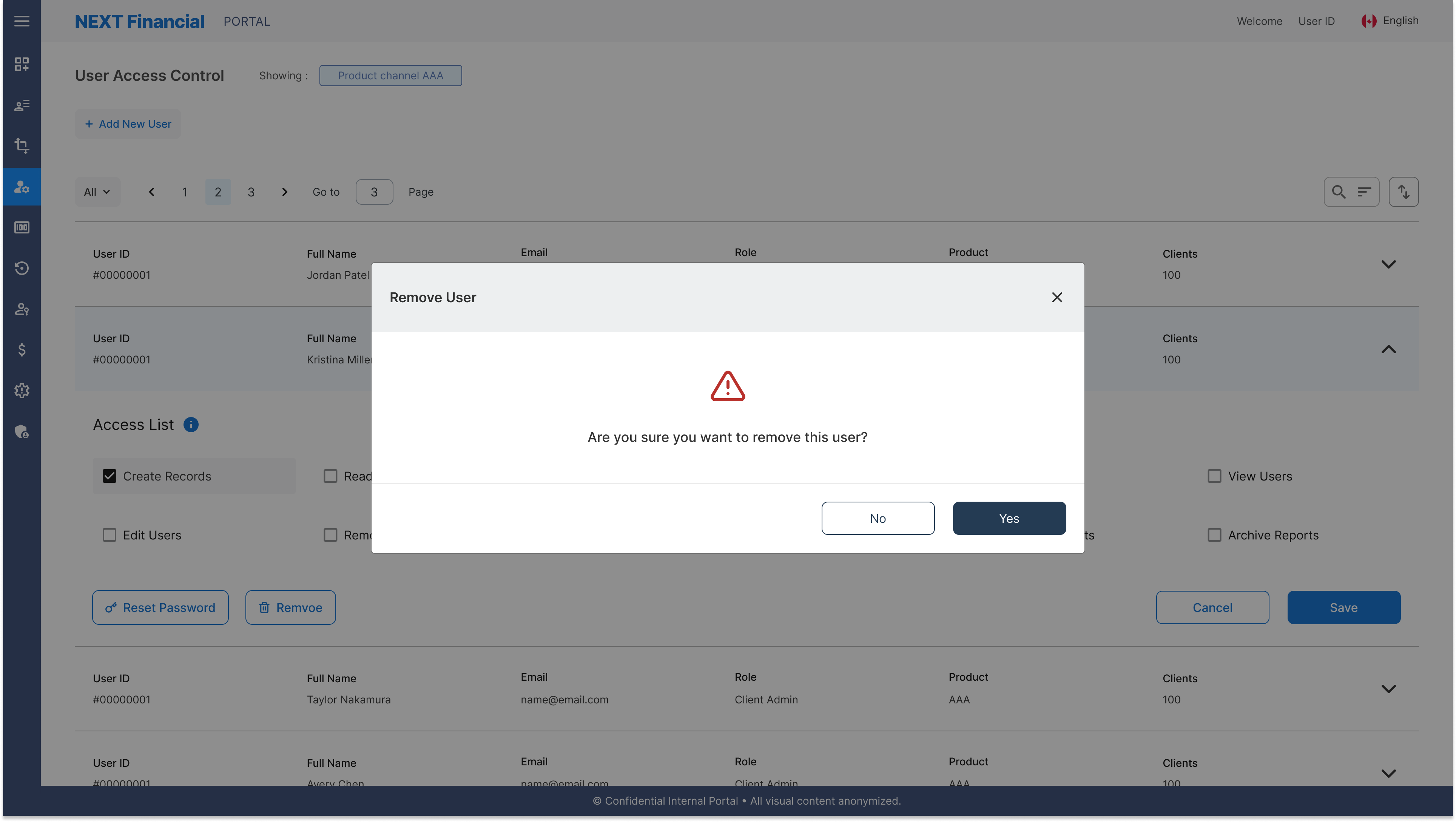
Tooltip & Remove User Modal
Contextual tooltips clarify field labels and permission levels, while a dedicated confirmation modal prevents accidental user removal with a clear two-step process.
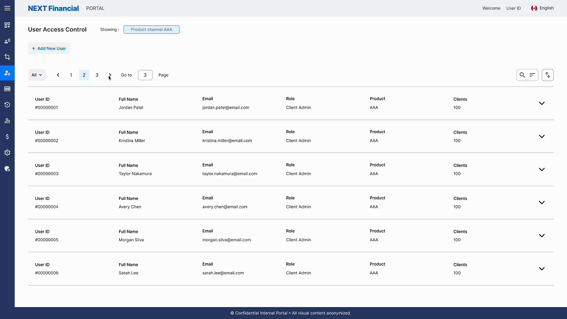
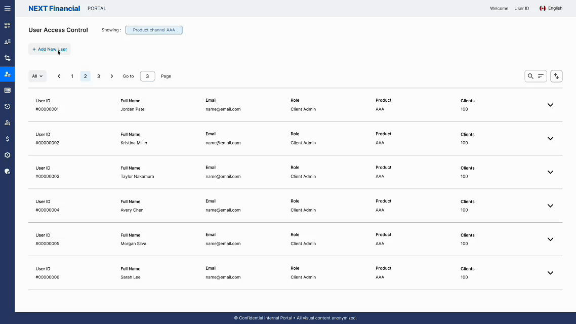
Pagination & Filter
Role-based filters and page-by-page navigation help administrators work through large user lists efficiently, with clear record counts and controlled navigation between pages.
Add New User Flow
A guided form collects required user details with real-time validation, confirming successful account creation with a notification and an immediately refreshed list view.
Gallery
Redesign Highlights