Global Payments UX: Redesigning a High-Conversion International Transfer Experience
Redesigning an international money transfer product to be clearer, more transparent, and easier to trust.
Impact
What Changed After Launch
Surfacing exchange rate and fee information upfront removed the biggest trust barrier in the transfer flow. Post-launch analysis showed improved conversion, backed by user testing feedback across 8 participants.
I finally knew what I'd pay before I even started. That's what made me trust it enough to go through with the transfer.
User Testing ParticipantThe rate and no-fee label right on the first screen. I didn't have to hunt for it. It changed how I felt about the whole thing.
User Testing ParticipantAfter the redesign the flow felt much more straightforward. I wasn't second-guessing myself at every step.
User Testing ParticipantEstimated Conversion Uplift
Post-launch analysis based on reduced drop-off at the rate and fee review step.
Rate Transparency
Exchange rate and no-service-fee label moved from the final step to the first screen.
User Testing
Participants across moderated sessions, with consistent feedback on improved clarity and trust.
The existing product faced critical challenges: the home page lacked a clear hierarchy of content and actions, the transfer flow was hidden, with unclear fees and exchange rates that slowed users down and reduced submissions, and the recipient list and transfer status pages relied on table layouts poorly optimized for smaller screens.
These problems created friction and drop-offs at key steps of the transfer journey, and risked eroding user trust in a competitive B2C market where clarity, speed, and transparency directly drive adoption.
All visuals and details have been anonymized to comply with NDA, but the design logic, structure, and challenges reflect the actual work delivered.
I led this redesign end-to-end, from competitor analysis and user research through interaction design and user testing, with every decision grounded in observed behaviour and validated against real transfer journeys.
Research
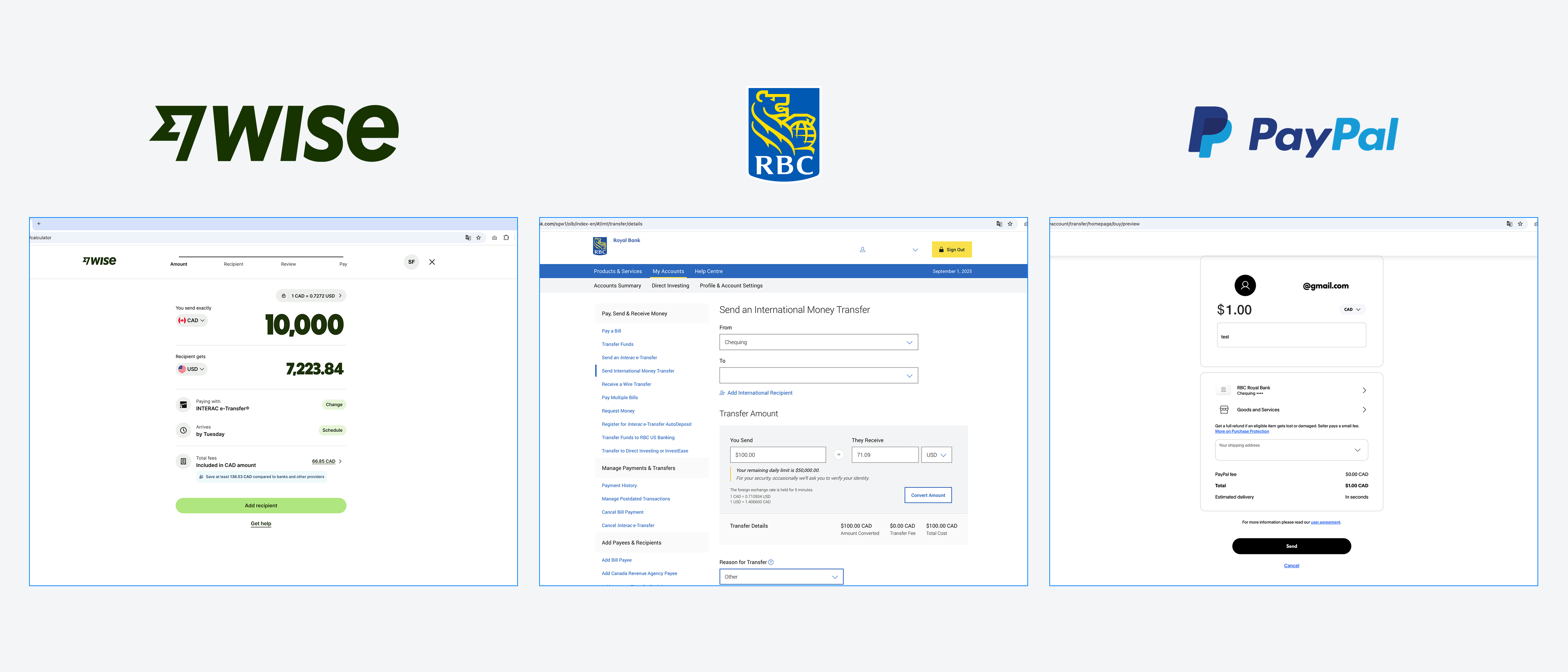
Competitors 💡
Wise · RBC · PayPal
I analyzed three major players in the international money transfer market: Wise, RBC Bank, and PayPal. Wise differentiates itself with clear exchange rate visibility, transparent service fees, and a simple step-by-step transfer process that helps build user trust. PayPal is strong in payment flexibility and ease of use but lacks detailed tracking and reliable rate guarantees. RBC provides the assurance of a regulated bank but offers a more complex interface with fewer user-friendly features.
Wise surfaced the most consequential insight: it shows the exchange rate and fee breakdown before users begin the transfer, not at the confirmation step. Users who see costs only at the end are more likely to abandon. This directly shaped two decisions in the redesign: moving live exchange rate display and a clear no-service-fee label onto the home page calculator, so trust is established before any commitment is made.
| Common Attributes |
|
|
|
|---|---|---|---|
| Ability to make send and collect money both | |||
| Need to sign in before transfer money | |||
| Transfer money process stepper 1 2 3 | |||
| Min & Max limits daily | |||
| Exchange rate hold/guarantee (by daily/hourly) | |||
| Clear service fee | |||
| Estimate arriving date | |||
| Transfer details | |||
| Add, edit, delete payee information | |||
| Multiple payment methods (bank account, credit card, wallet) | |||
| Notifications (SMS, email) | |||
| Purpose of payment |
Discovery
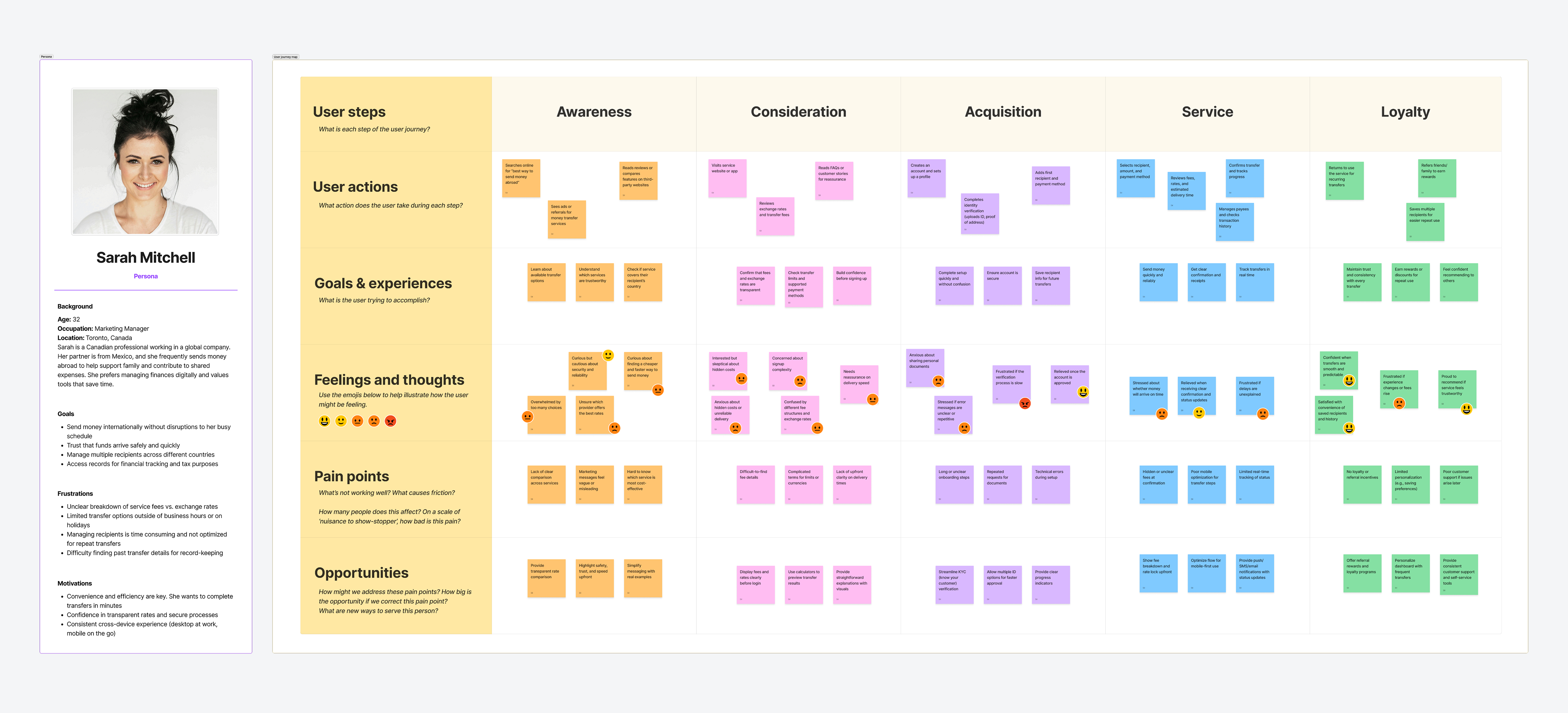
Persona & Journey Map 👤
Stage · Steps · Thoughts · Touchpoints · Emotions
I created personas to represent different types of users who depend on global money transfer services to receive support, send funds to friends and family, and manage expenses across borders.
The journey map captured the end-to-end experience, from discovering and considering the service to signing in, transferring money, managing payees, and reviewing transactions, with a focus on improving transparency and simplifying key processes.
Mapping user actions, goals, problems, and emotions at each stage revealed where the process felt unclear, slow, or untrustworthy. These insights shaped the redesign strategy: improve transparency, simplify key workflows, and deliver a consistent, mobile-first experience across devices.
Architecture
Userflow 🔁
Home · Transfer Money · Manage Payee · Transaction History Pages
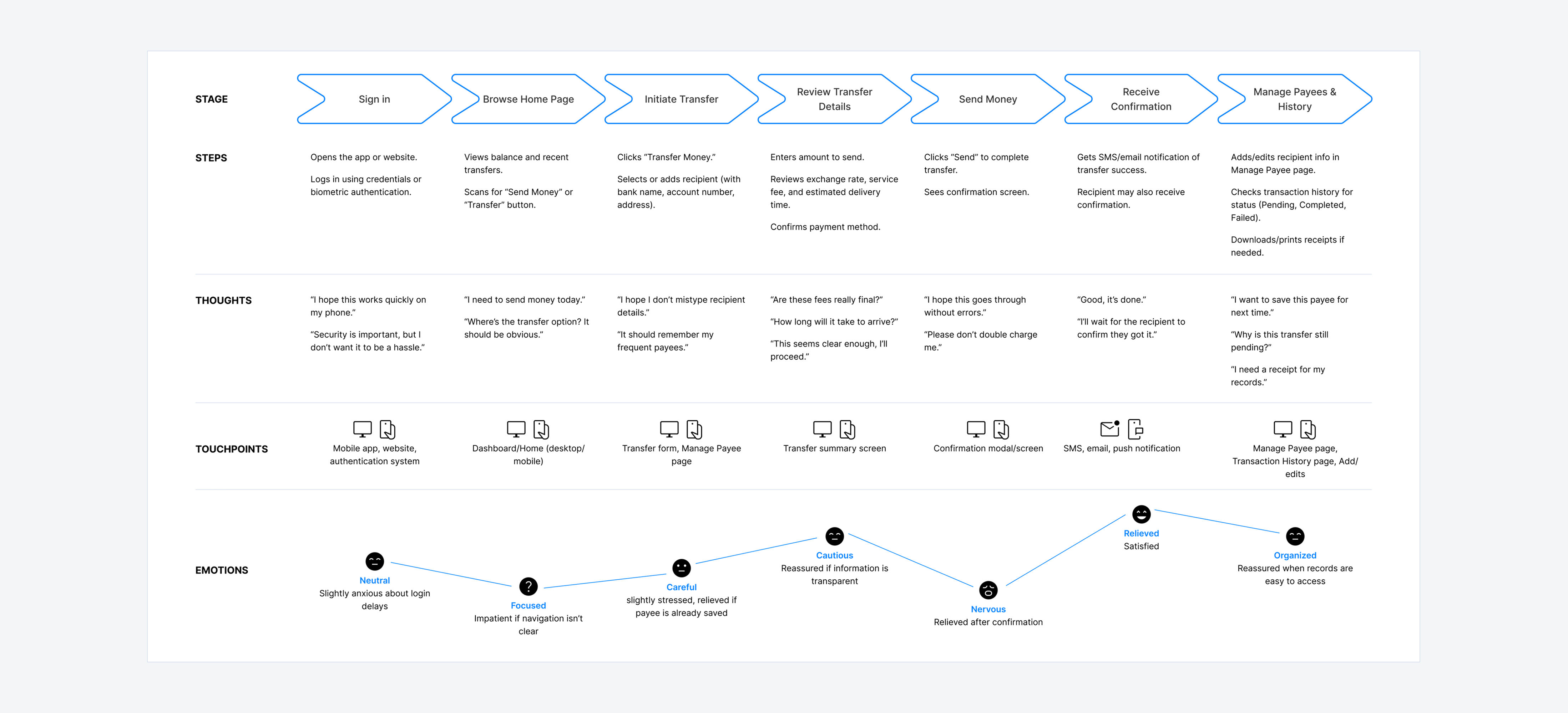
I created this user flow to map the complete experience of sending money internationally, from secure login through to transfer confirmation and transaction history. The flow covers the main journey of entering recipient details, reviewing fees, exchange rates, and delivery times, and confirming payment, while also accounting for supporting actions like managing payees, tracking transfers, and handling errors.
Visualising these interactions helped surface problems: unclear confirmation steps and complex payee management. Each pathway gives each pathway gives users clear feedback and guidance. The user flow became the foundation for refining the redesign, grounding decisions in user needs alongside business requirements.
Section 01
Home Page
Components: Navigation, Inputs, Promotion, and Carousel
⚠️ Pain Points
Competing visual sections and misaligned inputs fragmented the experience, reducing user focus and lowering promotional engagement.
Competing visual sections: Side nav, rate inputs, and promo banner created visual imbalance
Misaligned inputs with no hierarchy: Caused confusion and errors during task completion
Low-visibility promotional CTA: Poor placement confirmed by user behaviour data to reduce engagement
No intentional layout strategy: Page structure did not support user goals or conversion
🛠️ Solution
A focused linear layout with repositioned promotional content and a responsive structure delivered a consistent experience across all devices.
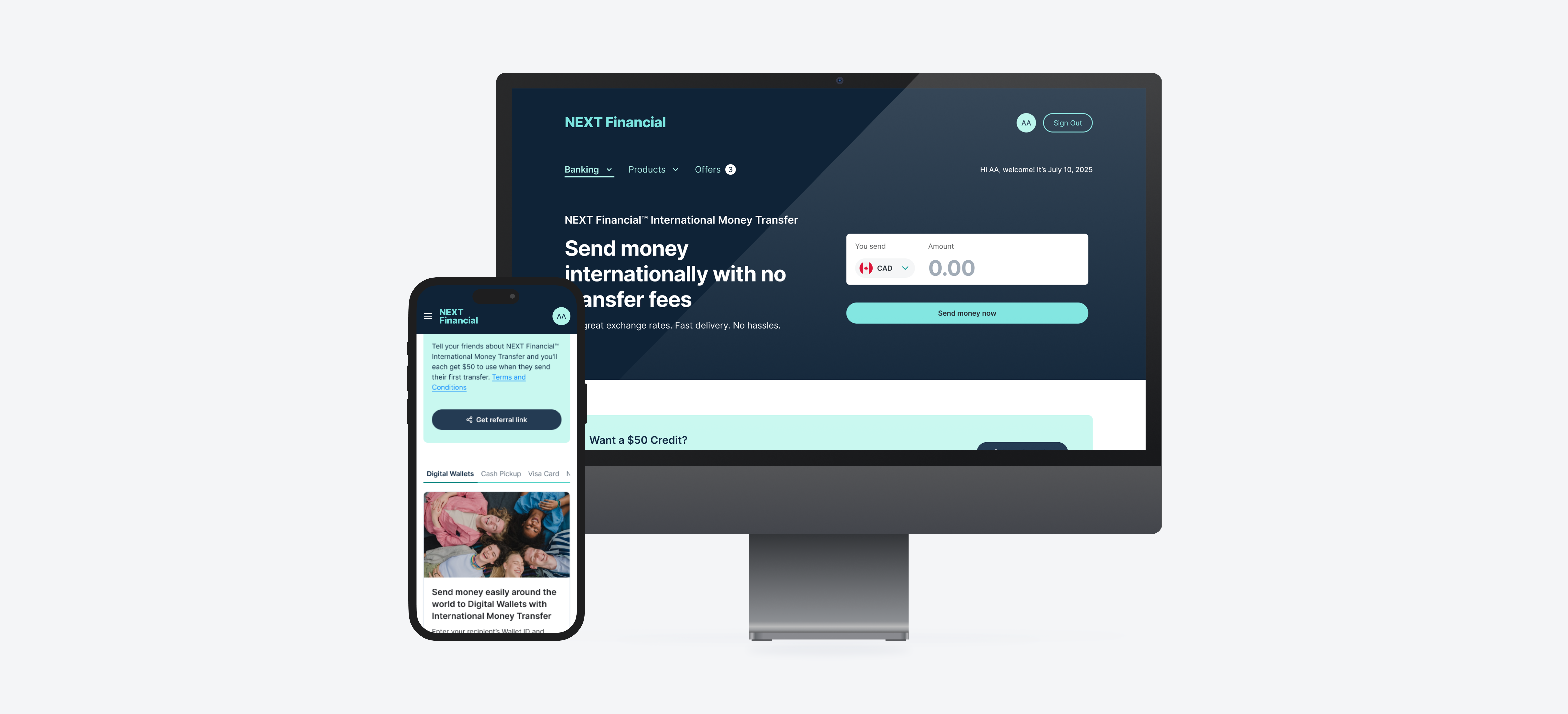
Connected home page input to transfer form: Amount entered on the home page calculator carries forward automatically, eliminating re-entry and creating a coherent start to the flow
Live exchange rate and no-service-fee label on home page: Key cost information is visible before users begin, reducing hesitation and drop-off at the point of commitment
Promotional content below hero: Repositioned for maximum visibility and engagement
Redesigned carousel: Each section clearly tied to specific user actions
Responsive & readable layout: Consistent experience across all device sizes
Full Page Scrolling & Navigation
Smooth vertical scroll across a focused linear layout surfaces exchange rate information and promotional content in sequence, without competing sections fighting for attention.
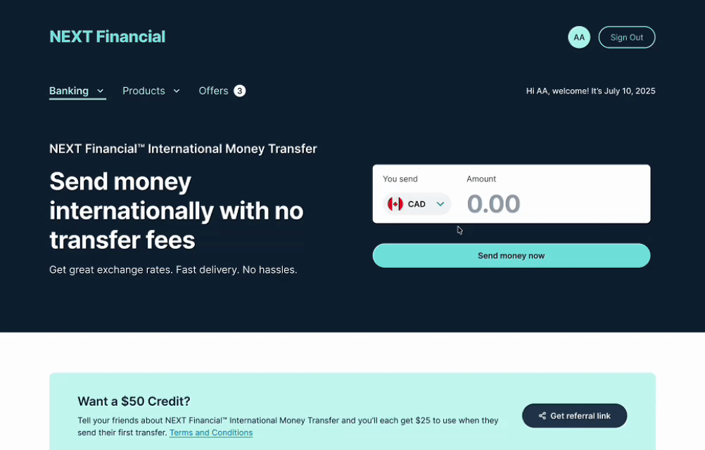
Put Amount
An inline amount input with live exchange rate calculation shows the converted value and estimated fee in real time, reducing hesitation before initiating a transfer.
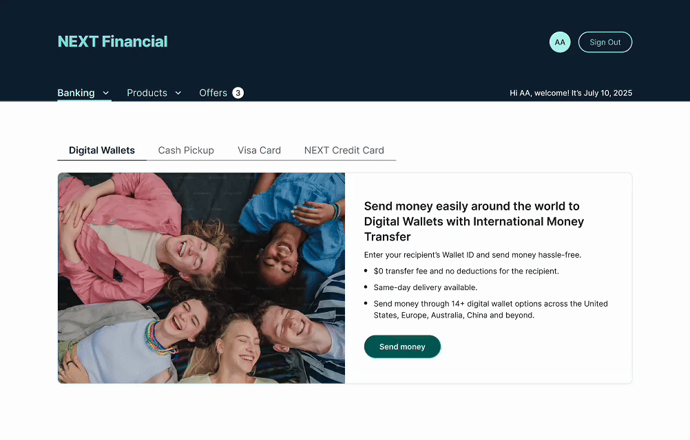
Transfer Method Tab
Tab-based navigation lets users switch between transfer methods while keeping the form state intact, minimising re-entry and reducing friction at the start of the flow.
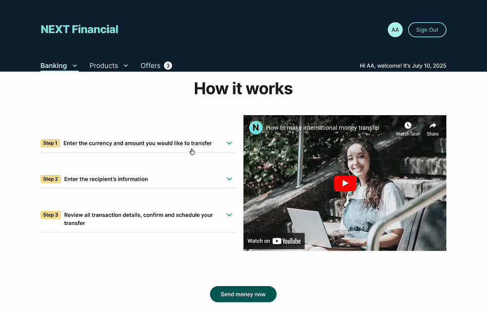
Process Accordion
A collapsible accordion breaks down the transfer process into clearly labelled steps, helping new users understand the flow without overwhelming the home page layout.
Section 02
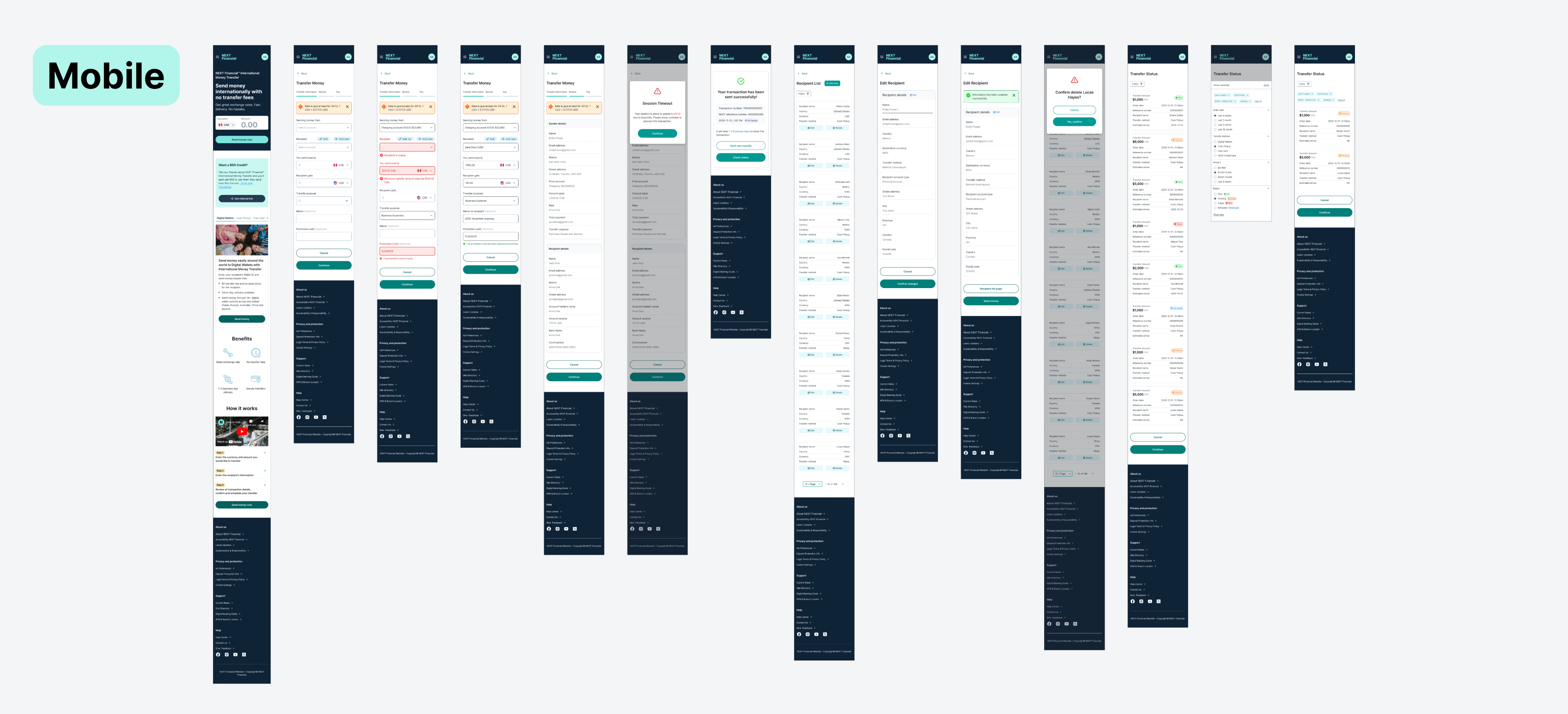
Send Money Page
Components: Stepper, Transfer Forms, Modal
⚠️ Pain Points
Nested accordion inputs and a weak step counter left users disoriented, while dense fields and an invisible timeout modal increased errors and eroded confidence.
Nested accordion inputs: Key fields for recipient, amount, and reason are hard to access
Unclear step counter: Users unsure about progress or what comes next
Densely packed, misaligned inputs: Increased likelihood of errors, especially for first-time users
Invisible timeout modal: No urgency cues, easy to overlook, undermining user confidence
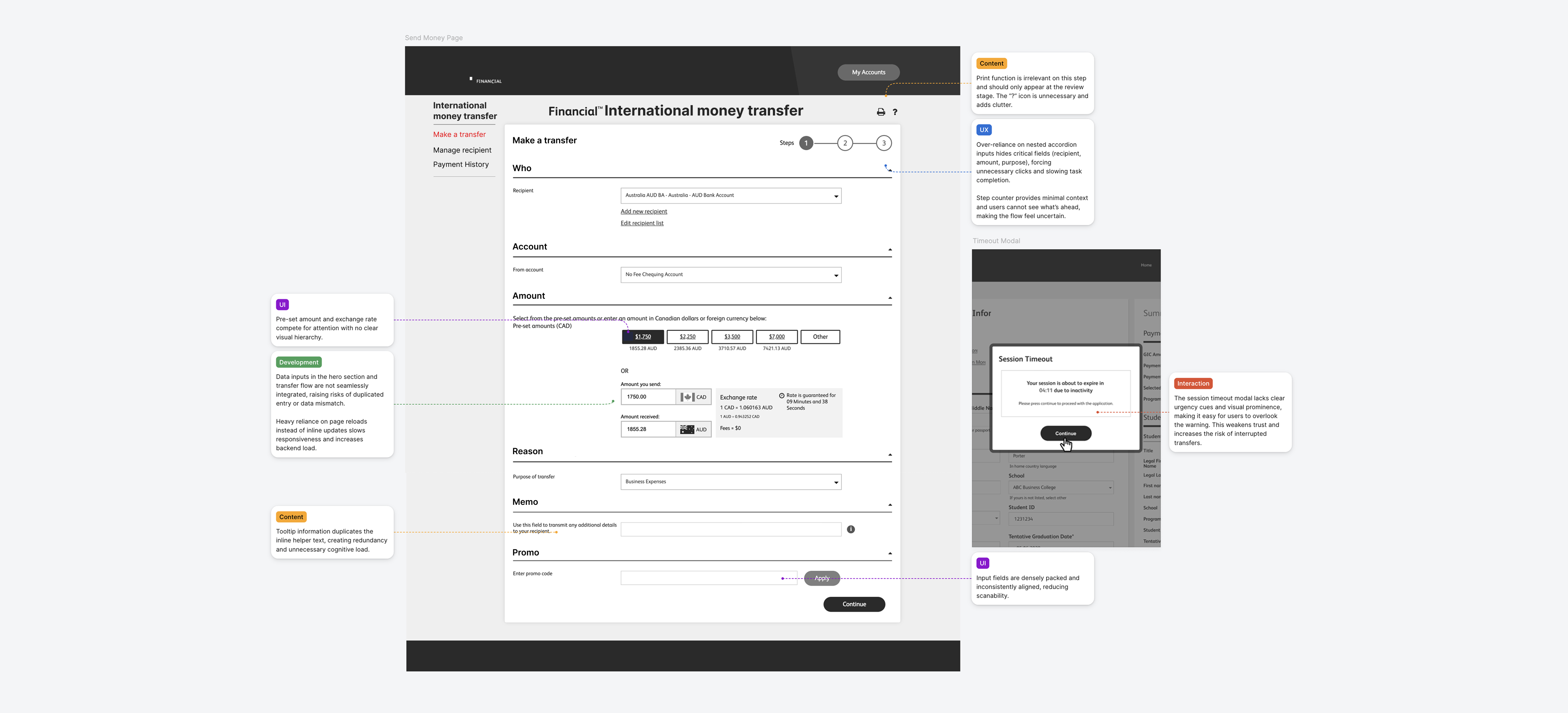
🛠️ Solution
Accordion inputs were replaced with a flat layout, progress was made visible, and key alerts were redesigned to communicate urgency at the right moments.
Flat single-page layout: All fields visible without extra clicks or nested accordions
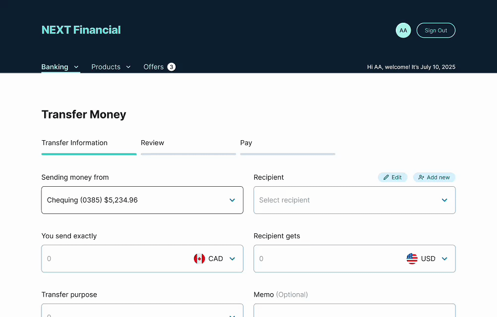
Redesigned step counter: Clear progress indicators and labels keep users oriented
Improved input spacing & contextual validation: Reduces errors and supports accessibility
Rate expiry alert near top of page: Reinforces time sensitivity throughout the transfer flow
Redesigned timeout modal: Bold primary CTA and brand-aligned styling communicate urgency clearly
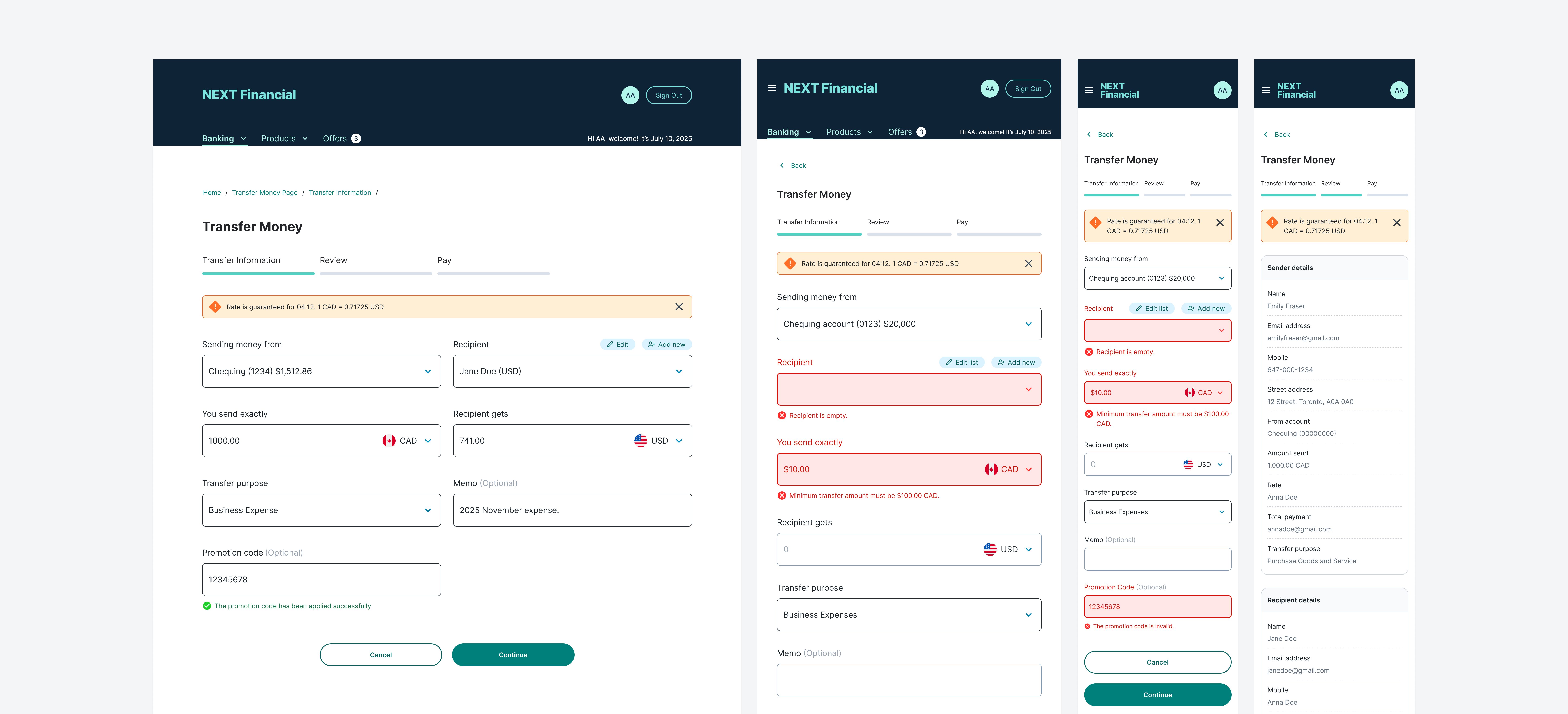
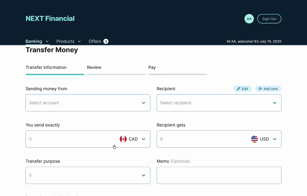
Transfer Information Inputs
A flat, single-page form replaces the previous nested accordion, exposing all required transfer fields at once for faster completion and less disorientation throughout the flow.
Inputs Error Message
Inline validation highlights individual field errors in real time with plain-language messages, guiding users to correct issues before attempting to submit an incomplete form.
Timeout Modal
A prominently styled alert warns users of session inactivity before automatic logout, with a visible countdown and a single action to resume the transfer without losing progress.

Page Level Success Message
A full-page confirmation screen reinforces a completed transfer with key details, estimated delivery time, and clear next steps to review history or manage payees.
Section 03
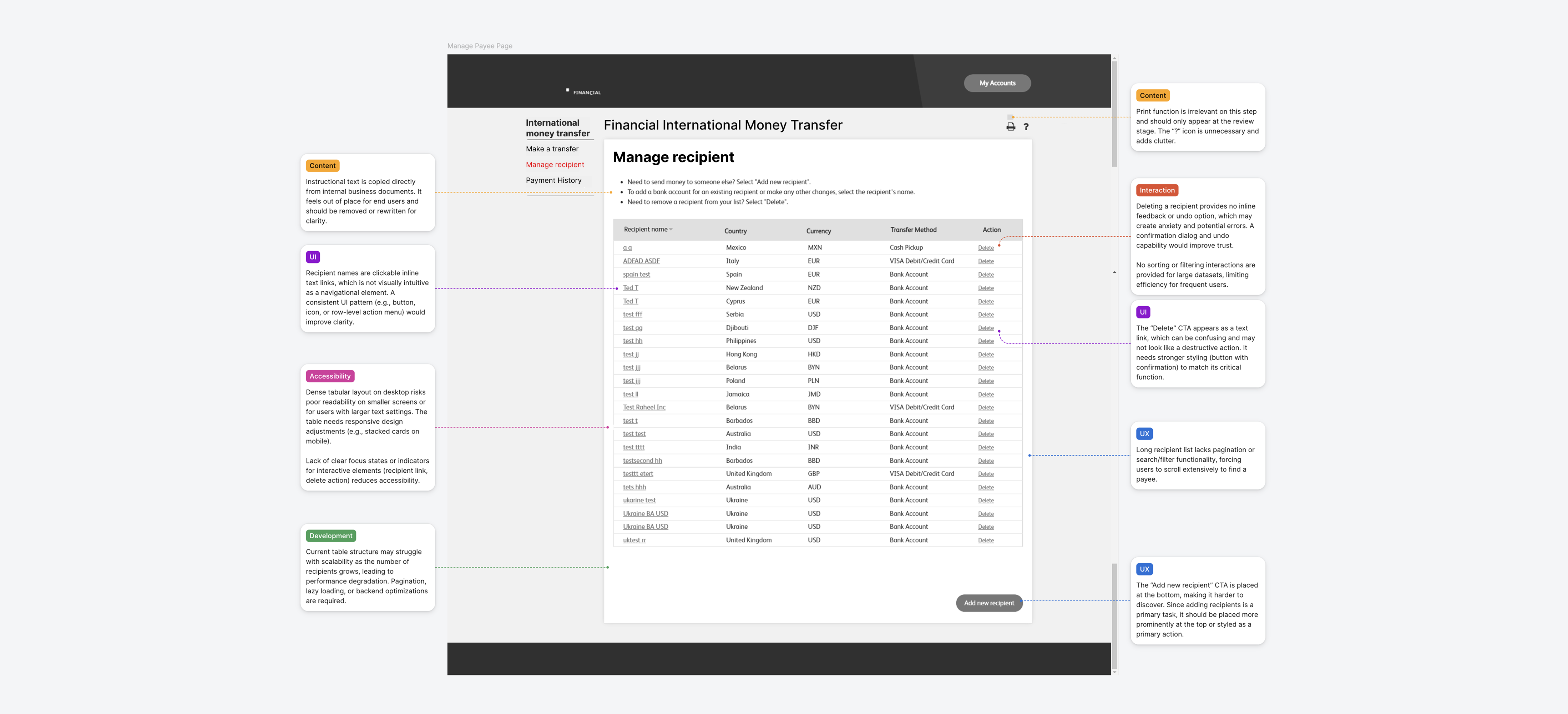
Payee Management Page
Components: Filter, Table
⚠️ Pain Points
No filtering, poor action visibility, and a layout not built for mobile made the payee list slow, error-prone, and frustrating to use.
Unfiltered, scrollable list: Increasingly inefficient to find payees as the list grew
Edit & delete as plain text links: Easy to miss and tap by mistake, especially on mobile
Not optimised for mobile: Required horizontal scrolling and manual zooming
"Add new recipient" lacked visibility: Key action buried, making the flow unintuitive
🛠️ Solution
Key actions were surfaced as buttons, mobile was restructured into stackable cards, and the add/edit flow was simplified end to end.
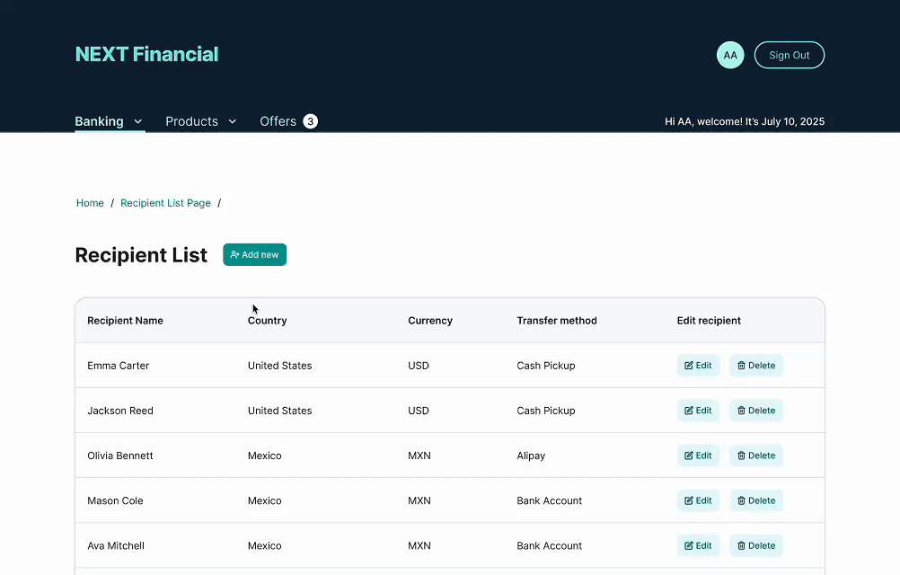
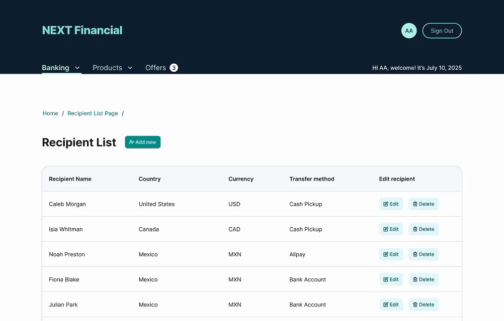
Responsive layout with clear spacing: Easier scanning across both desktop and mobile
Buttons replace text links for edit, delete & add: Improved visibility and reduced interaction errors
Stackable mobile cards: Easier to browse and tap on smaller screens
Simplified add & edit flow: Guides users more clearly through recipient management
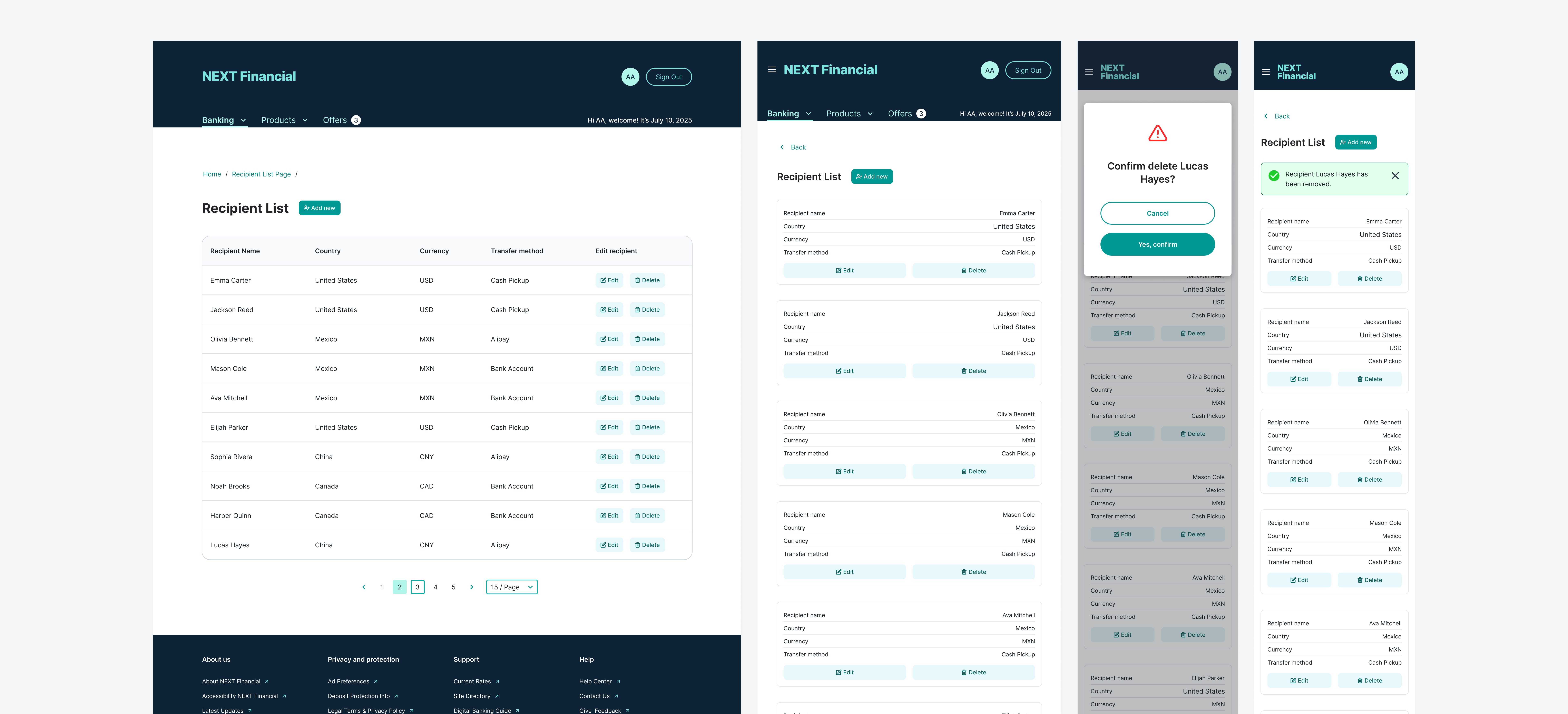

Add New Recipient
A simplified form collects recipient details with inline validation and contextual hints, guiding users through bank and account fields to reduce entry errors from the start.

Edit Recipient
Pre-populated fields allow users to update payee details quickly, with changes confirmed by a success notification and an immediately refreshed recipient list.
Delete Recipient
A confirmation modal requires explicit user intent before removing a payee, preventing accidental deletions and displaying a clear outcome message after the action completes.
Pagination
Page-based navigation across the recipient list keeps the table focused and scannable, with record counts and forward/back controls for managing large payee collections efficiently.
Section 04
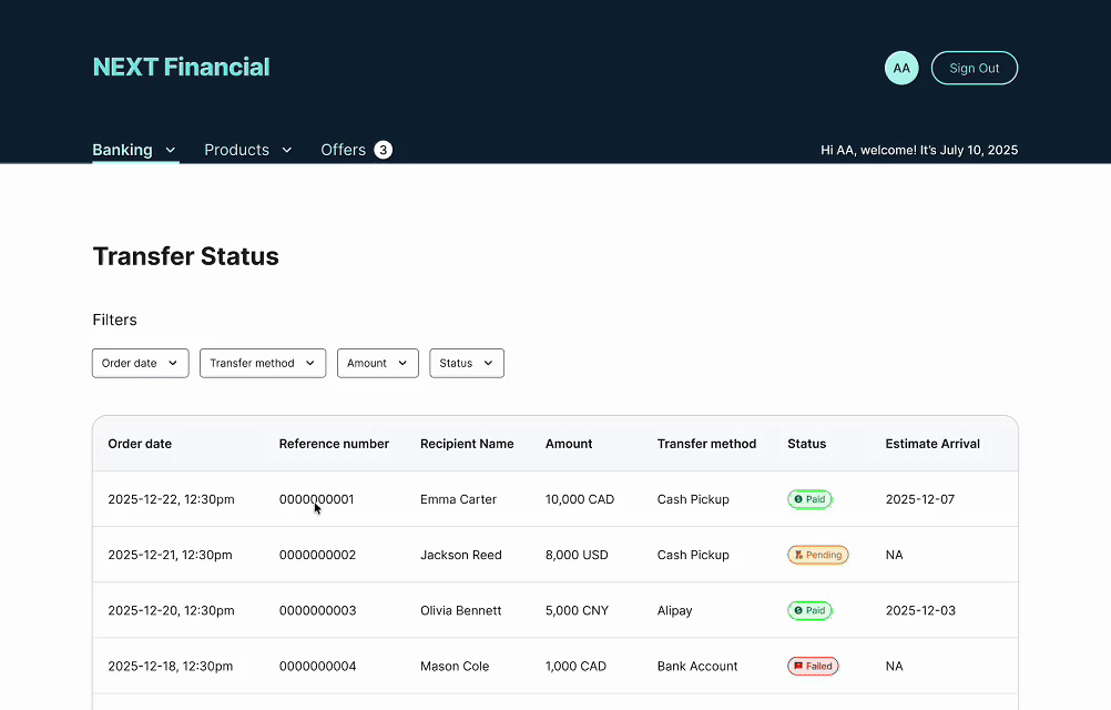
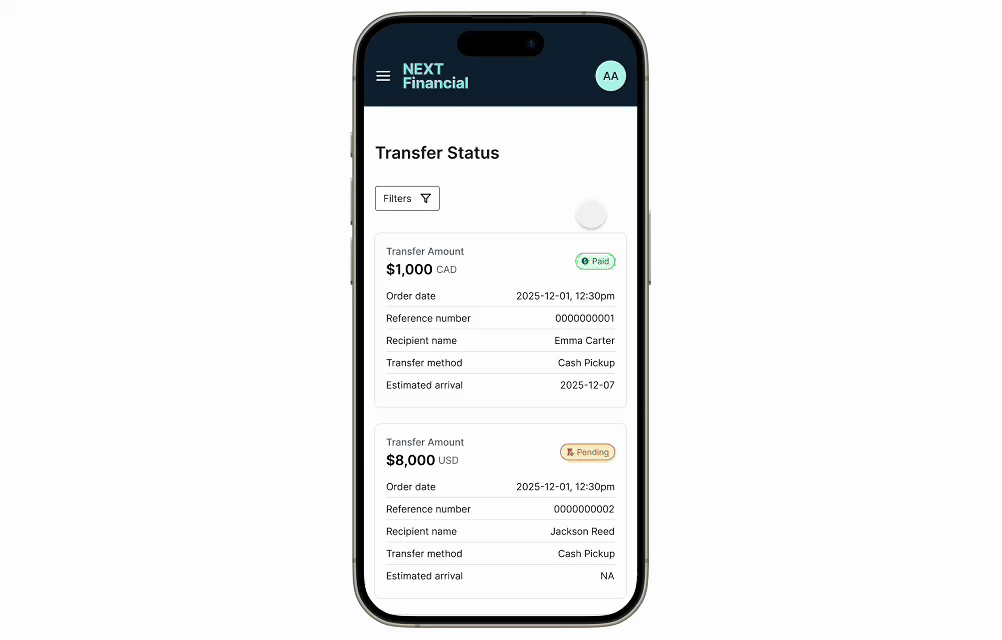
Transaction History Page
Components: Filter, Table
⚠️ Pain Points
No filtering, a packed table, and a broken mobile layout made transaction history nearly unusable for users managing multiple transfers.
Flat filters with no keyword search: No way to refine or contextualise results
Tightly packed table with no hierarchy: Hard to scan recipients and statuses quickly
No pagination: Long histories required extensive scrolling to find specific entries
Broken mobile layout: Columns squished, text cut off, horizontal scrolling required
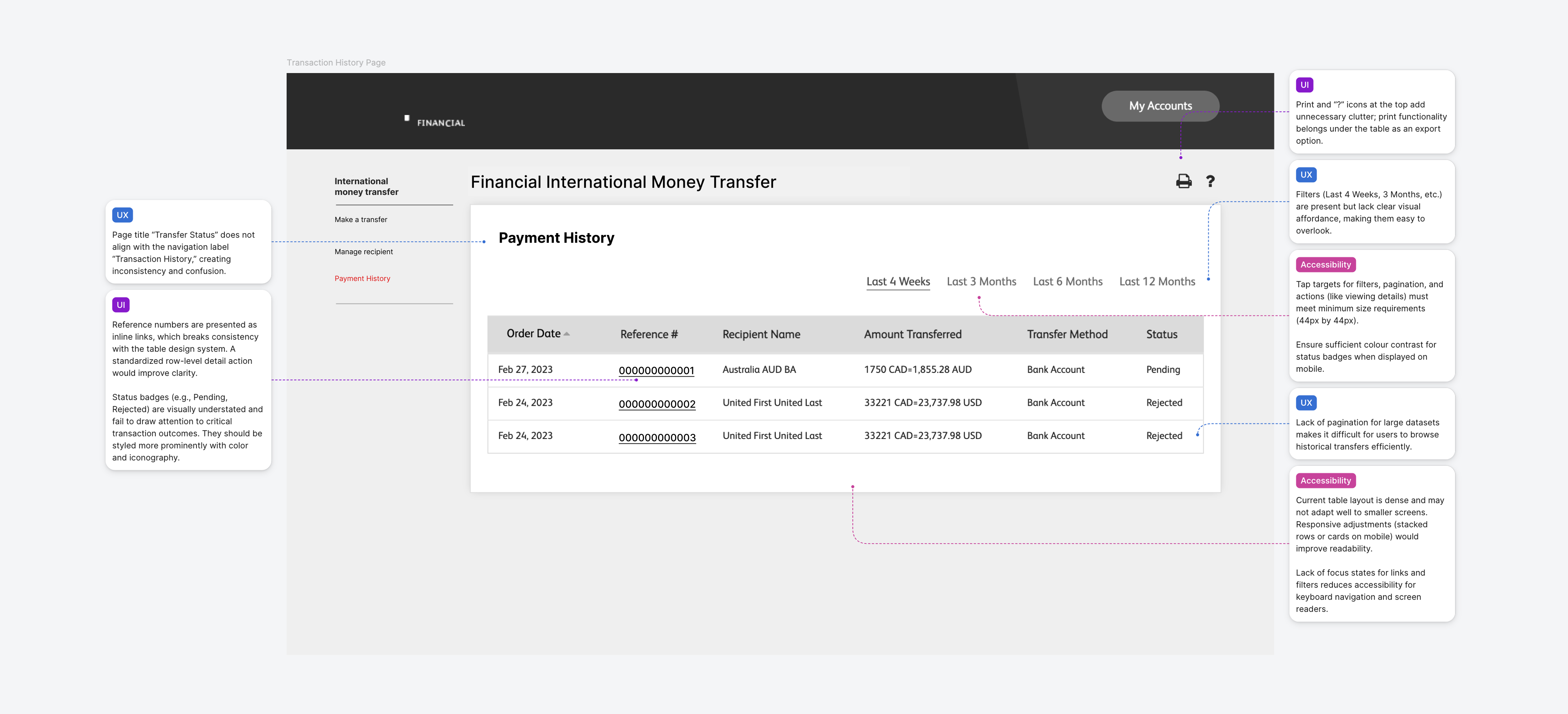
🛠️ Solution
New filters, pagination, and a modernised table brought clarity and efficiency across all devices for users managing large transfer histories.
Filters & search by date, currency, recipient, status: Refined sorting for any use case
Modernised table with colour-coded status indicators: Key info instantly scannable
Pagination for large datasets: Breaks long histories into manageable pages for faster navigation
Mobile stacked cards: Preserves clarity and improves tap-target accuracy on small screens
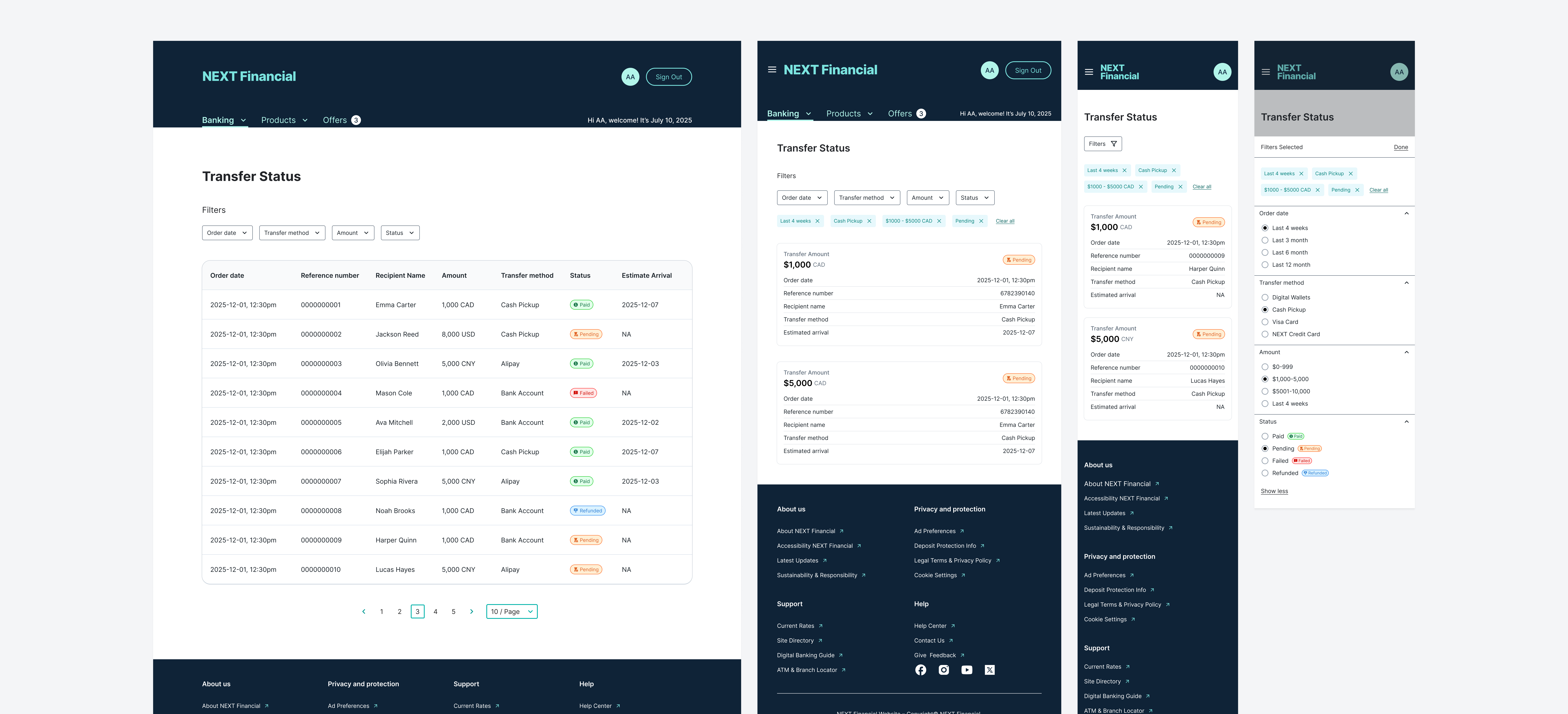
Filter on Desktop & Tablet
Date range pickers, currency selectors, recipient search, and status filters combine to let users narrow large transaction histories to exactly the records they need.
Filter on Mobile Screen
On smaller screens, filters collapse into a bottom sheet overlay with clear apply and reset controls, preserving the full filter set without cluttering the mobile table view.
Validation
User Testing
Moderated Testing · Think-Aloud · Qualitative Insights
I never know what the fee is going to be until the very end. By then I've already spent time filling everything in.
Transfer User, Pre-redesignSeeing the rate and fee right on the home page made me feel like I actually knew what I was getting into before I started.
Transfer User, Post-redesignThe steps showing at the top helped a lot. I could see I was almost done instead of guessing how much was left.
Transfer User, Post-redesignI ran moderated user testing sessions focused on key user flows and interaction points. Participants thought aloud throughout, which surfaced mental models and confidence gaps alongside task completion patterns.
Three themes came up consistently. First, users were more confident navigating the redesigned transfer flow. The visible step counter and flat form layout reduced the hesitation that had appeared repeatedly in the legacy interface, where nested accordions left users unsure of their progress. Second, moving fee and exchange rate information earlier resolved a recurring trust gap: in the original design, users described feeling "surprised" by costs at the confirmation step; in the redesign, they could evaluate the transfer before committing. Third, mobile sessions confirmed that the stacked card layout for payee and transaction views eliminated the horizontal scrolling and mis-tap errors seen with the legacy table format.
These findings directly shaped final refinements to label clarity, feedback timing, and the prominence of rate expiry alerts. Without testing, the urgency of those changes would not have been apparent.
Due to NDA constraints, testing scenarios used anonymized content while preserving real-world complexity and decision-making patterns.
Insights
Data Analysis 👀
Qualitative Synthesis · Pattern Identification · Insight-Driven Refinement
After user testing, I synthesized observations across sessions to identify recurring behavioural patterns rather than isolated usability issues. The analysis focused on moments that affected user confidence, efficiency, and trust, particularly where hesitation, misinterpretation, or uncertainty appeared consistently across different touch points.
Themes emerged around clarity of hierarchy, progression cues, recognition over recall, and reassurance at key moments. These patterns pointed to opportunities to reduce cognitive load and better match the interface to users' mental models, particularly in high-stakes, decision-heavy scenarios.
The analysis showed that relatively small adjustments (clarifying hierarchy, refining language, and improving the timing and visibility of system feedback) had a real impact on how confidently users moved through the flow. These insights fed directly into subsequent design iterations, keeping changes grounded in observed behaviour rather than assumptions.
Delivery
Responsive Web
Desktop · Tablet · Mobile
Responsiveness was built in from the start, not retrofitted. The design was resolved into layouts for desktop, tablet, and mobile, with each breakpoint considered throughout the process.
Rather than scaling layouts down, I adjusted hierarchy, spacing, and interaction density based on context of use. Priority actions stay within easy reach on smaller screens; secondary information is disclosed progressively to reduce visual noise, without sacrificing consistency or brand integrity.
Discover More