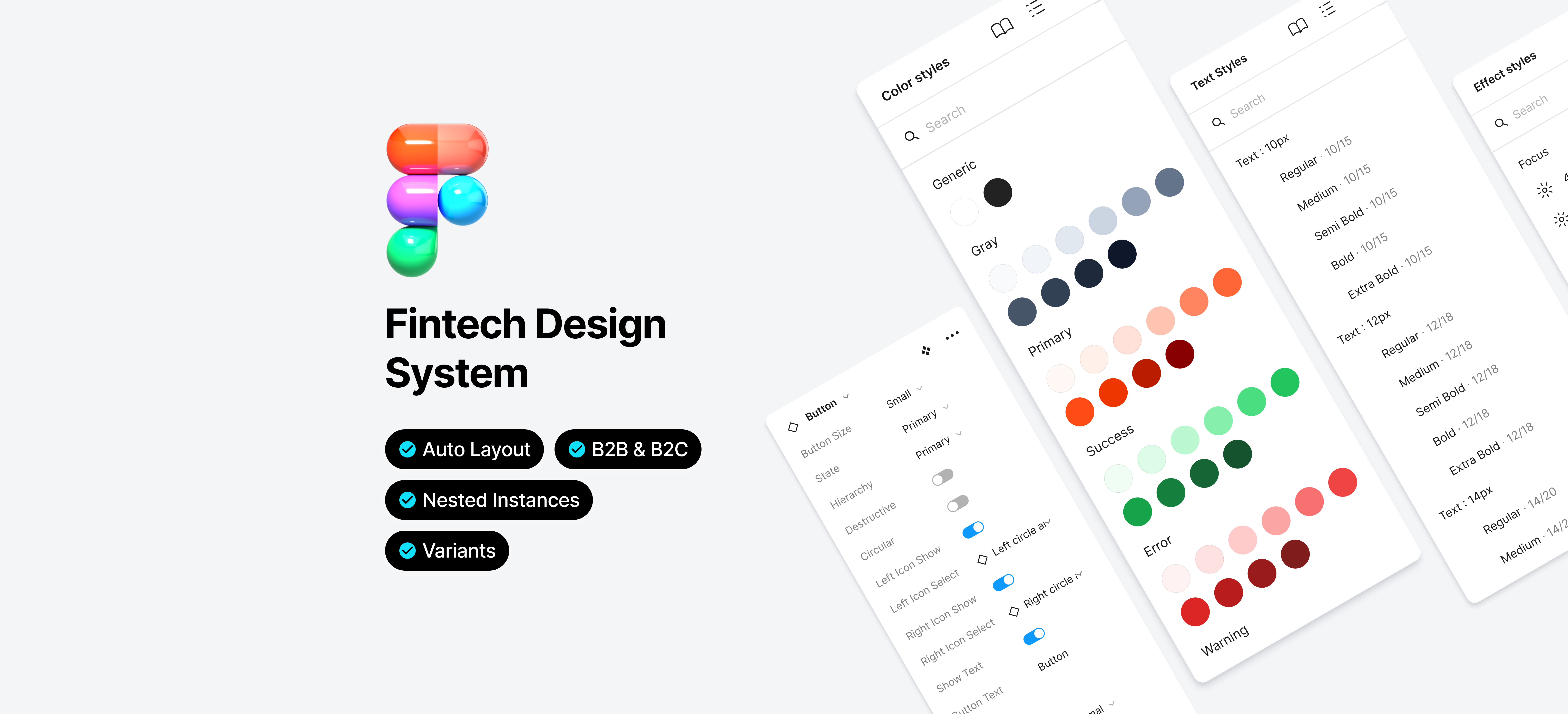
Design System
Building a shared design system for a large financial institution to unify B2B and B2C digital products across multiple teams.
Impact
What Changed After Launch
Within 3 months, 12 components were shipped and adopted across all five product lines. Unified tokens reduced visual inconsistencies in production, and teams reported faster design cycles once the shared library was in place.
Unifying the tokens across platforms immediately cut down on styling inconsistencies. We saw fewer bug reports tied to visual regressions after that.
Frontend DeveloperHaving a shared Figma library meant I wasn't rebuilding the same patterns for each product line. It freed up time for actual design decisions.
Product DesignerThe working sessions made it feel collaborative rather than handed-down. Teams bought in because they had a say in how the components evolved.
Product TeamComponents Shipped
Button, modal, table, date picker, pagination, stepper, tooltip, inputs, notification, header, footer, and more.
Product Lines Adopted
GMT, ISP, ISBO, COR, and RBA all adopted the component library across B2B and B2C platforms.
Time to Full Adoption
From first component shipped to system adopted across all five product lines.
This project built a shared design system for a large financial institution covering both B2B and B2C digital products. As the organization scaled, multiple teams had developed their own patterns and visual styles, producing fragmented user experiences and visual inconsistencies across tools.
The system needed to give designers and developers a common foundation: faster collaboration, less redundant work, and consistent brand expression across internal platforms.
All visuals and details have been anonymized to comply with NDA, but the design logic, structure, and challenges reflect the actual work delivered.
I led the creation of foundational components and design tokens for a shared system covering both B2B and B2C platforms, working directly with product teams and developers to drive adoption across all five product lines.
Foundations
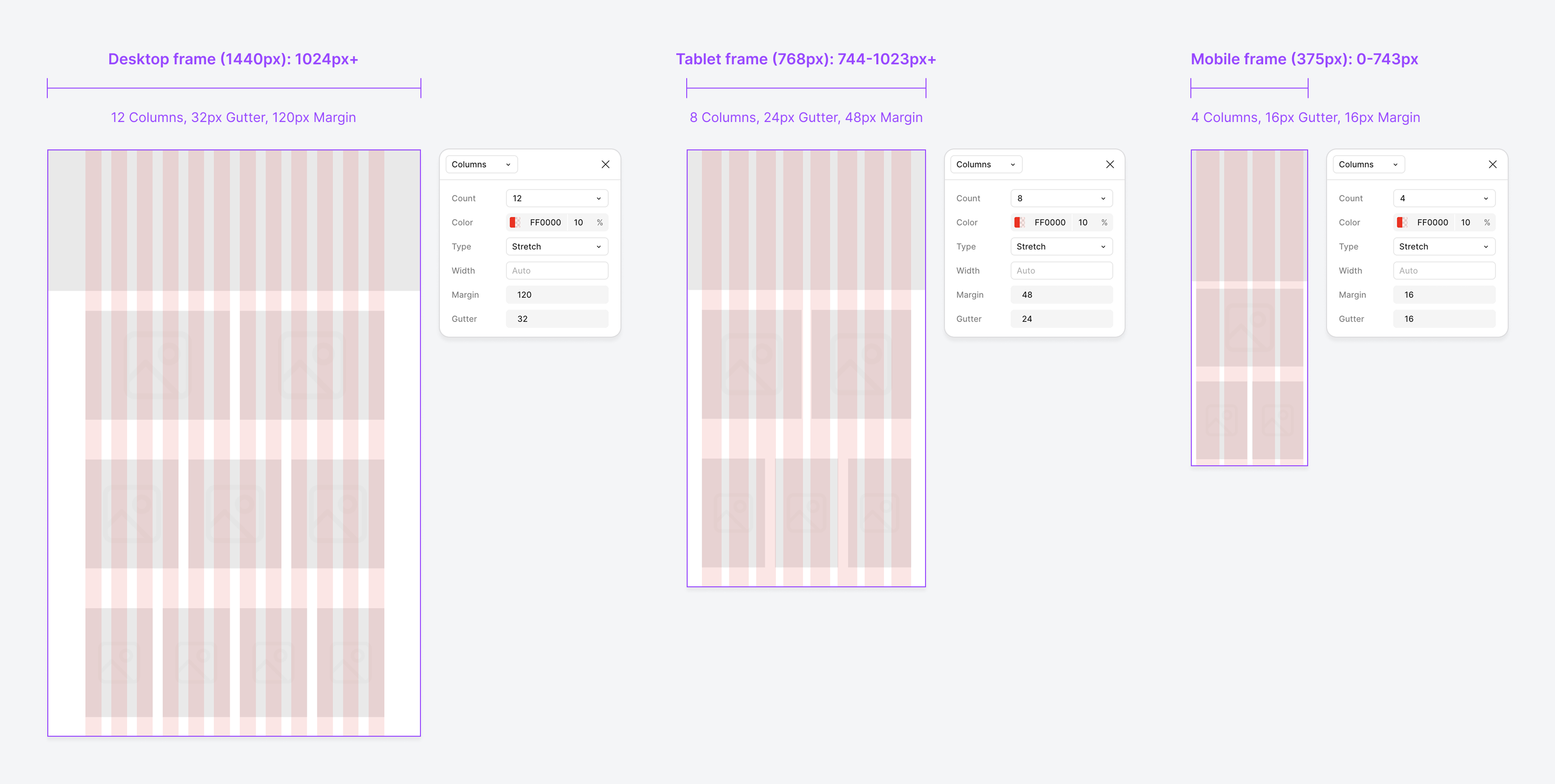
📐 Grid Layout System
We defined a layout grid for desktop, tablet, and mobile frames. It is the foundation for page layouts, content alignment, and modular component placement across our B2C web platform.
Desktop targets large screens (1440px and above), supporting multi-column layouts and complex information hierarchy. Tablet adapts for mid-sized devices, maintaining structure while simplifying content presentation. Mobile focuses on single-column or simple multi-column layouts for clarity.
Foundations · Styles
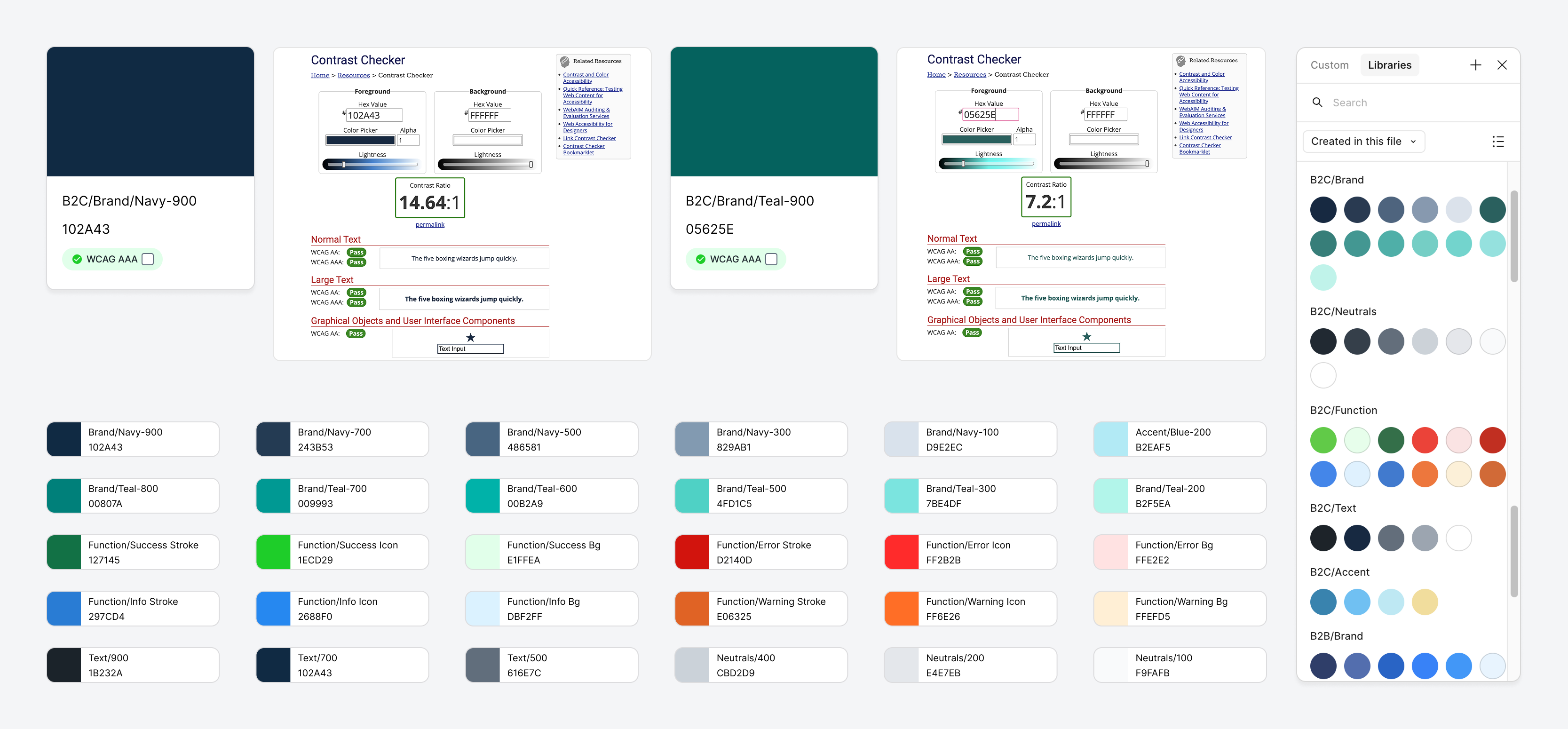
🎨 Colour Palette
The palette defines the core visual language of our B2C platform, balancing brand identity with accessibility. Organised into Brand, Neutral, and Functional colours, all meeting WCAG AA/AAA contrast standards. Brand colours highlight key actions, neutrals support backgrounds, and functional colours communicate status. Together they produce a consistent, accessible visual identity across devices.
Brand Colours
Built around Navy and Teal tones, representing trust, professionalism, and digital innovation. Core brand shades are optimized for WCAG AAA accessibility to ensure maximum readability.
Neutrals & Texts
A balanced grey scale for backgrounds, surfaces, and typography. Supports a clean, professional UI without visual clutter.
Function Colours
Dedicated colours for Success, Warning, Error, and Information states. Each functional colour has variations (stroke, background, icon) for use in different UI contexts.
Accessibility
All primary brand colours meet WCAG AA or AAA contrast standards for normal and large text. Contrast ratios are documented alongside each colour for reference.
Foundation
Text Styles
The type system covers both B2C responsive interfaces and B2B fixed platforms, built to support content-rich layouts without sacrificing readability or brand presence.
Inter is the primary typeface, chosen for its clarity and accessibility in digital environments. Fixed line heights preserve a consistent vertical rhythm across devices, whether in dense data views or more spacious content layouts.
Letter spacing is minimal for body text to aid reading flow, and slightly tightened for large headings to keep them compact. Combined with responsive scaling, these choices keep type legible across screen sizes.
All type styles meet WCAG AA contrast standards.
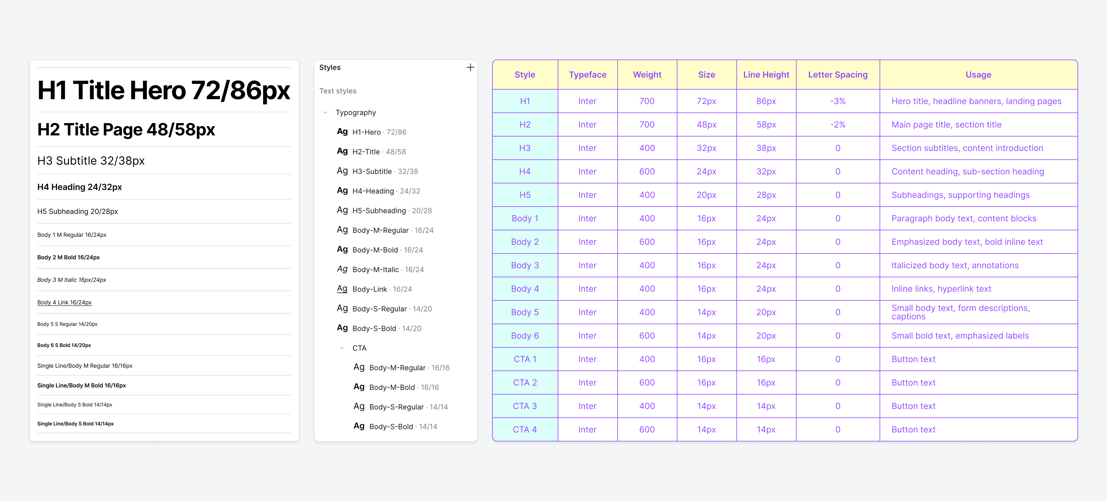
| Style | Typeface | Weight | Size | Line Height | Letter Spacing | Usage |
|---|---|---|---|---|---|---|
| H1 | Inter | 700 | 72px | 86px | -3% | Marketing hero & landing page headline (B2C only) |
| H2 | Inter | 700 | 48px | 58px | -2% | Page title, feature section header (B2C); dashboard panel title (B2B) |
| H3 | Inter | 400 | 32px | 38px | 0 | Section intro, content area header |
| H4 | Inter | 600 | 24px | 32px | 0 | Card heading, modal title, table section label |
| H5 | Inter | 400 | 20px | 28px | 0 | Sidebar heading, form group label, widget title |
| Body 1 | Inter | 400 | 16px | 24px | 0 | Primary reading text, paragraph content |
| Body 2 | Inter | 600 | 16px | 24px | 0 | Inline emphasis, key terms, data highlights |
| Body 3 | Inter | 400 | 16px | 24px | 0 | Annotations, disclaimers, footnotes |
| Body 4 | Inter | 400 | 16px | 24px | 0 | Hyperlinks within body text |
| Body 5 | Inter | 400 | 14px | 20px | 0 | Form helper text, input captions, metadata |
| Body 6 | Inter | 600 | 14px | 20px | 0 | Field labels, table column headers, status tags |
| Large Primary | Inter | 600 | 16px | 16px | 0 | Main action: confirm, submit, proceed |
| Large Ghost | Inter | 400 | 16px | 16px | 0 | Secondary action: cancel, go back |
| Small Primary | Inter | 600 | 14px | 14px | 0 | Inline primary action: save, apply |
| Small Ghost | Inter | 400 | 14px | 14px | 0 | Inline secondary action: edit, dismiss |
Foundation
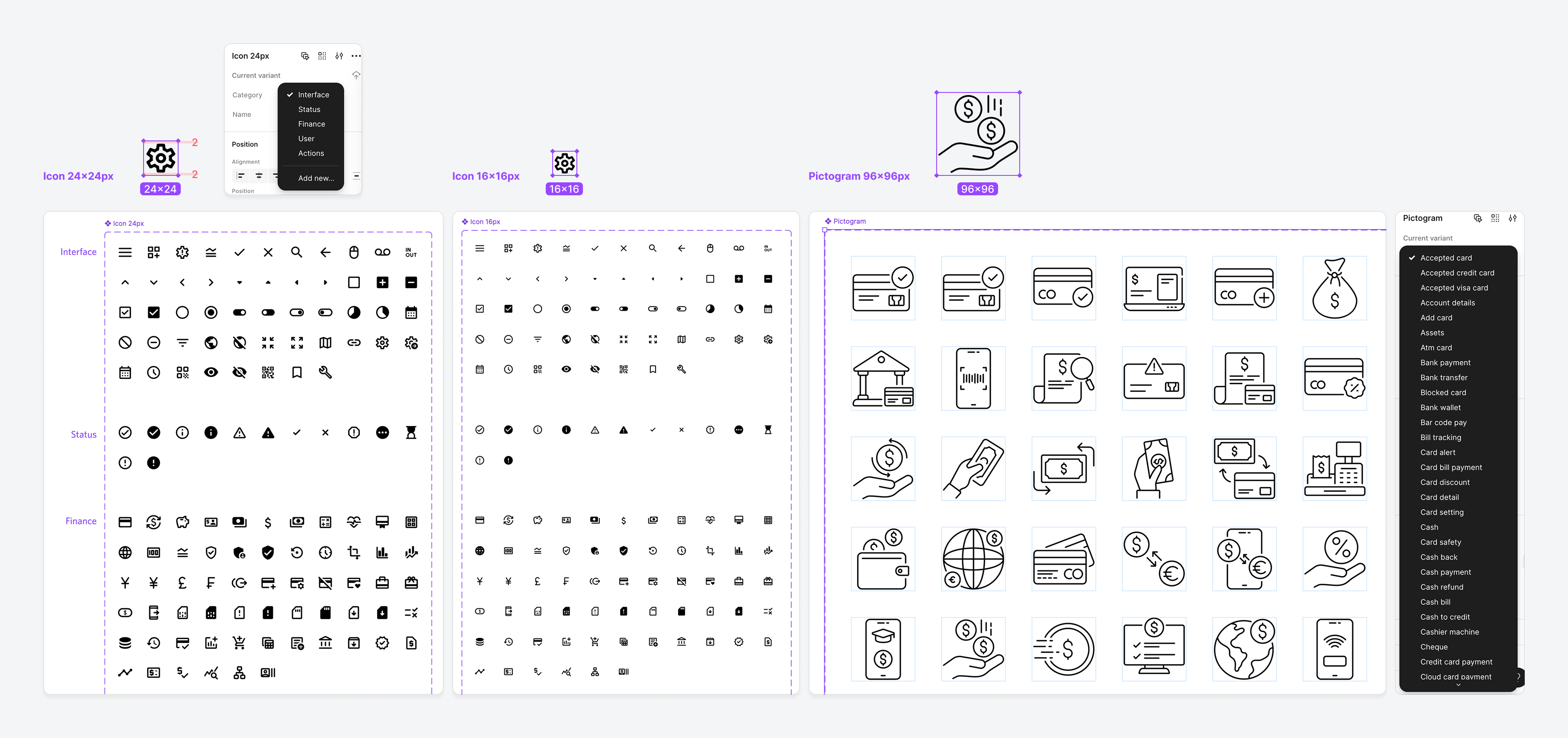
Icon & Pictogram
Icons and pictograms cover B2B, B2C, and responsive web contexts, following accessibility standards for contrast, sizing, and semantic alignment.
Icons
Sourced and customized using the Material Design Icons Figma plugin. Organized into five core categories: Interface, Status, Finance, User, and Actions, supporting both 24x24px and 16x16px sizes for flexible application in responsive layouts (e.g., forms, tables, buttons).
Pictograms
Sourced from the IconScout Figma plugin, designed at 96x96px for illustrative and expressive use in marketing banners, onboarding, and feature highlights. Each pictogram aligns with key financial use cases such as transfers, payments, and account security.
Component
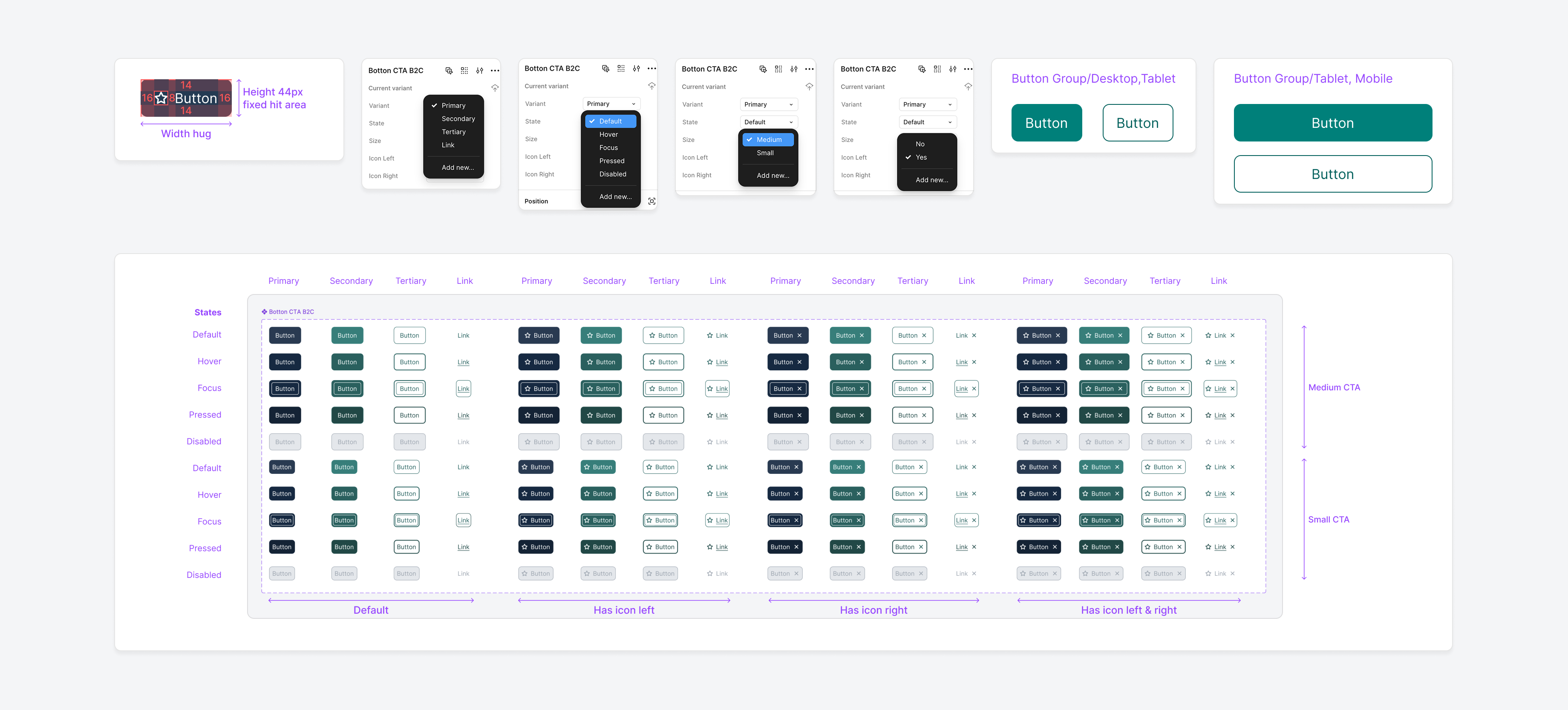
CTA Buttons & Links
Each button supports consistent interaction feedback across states: Default, Hover, Focus, Pressed, and Disabled. All states meet WCAG AA accessibility standards for contrast and usability. Use one Primary Button for the main action on a screen, Secondary or Tertiary Buttons for supporting actions, and Links for navigation.
Primary Button
Used for the main action on a page or modal. Styled with solid brand colours to draw attention.
Secondary Button
Supports the primary action, typically used for alternate or supporting actions. Outlined style maintains a lighter visual weight.
Tertiary Button
Lowest priority action, often styled as a text button or subtle outline, ensuring minimal distraction.
Link
Inline or standalone navigational links styled for clarity and accessibility.
Component
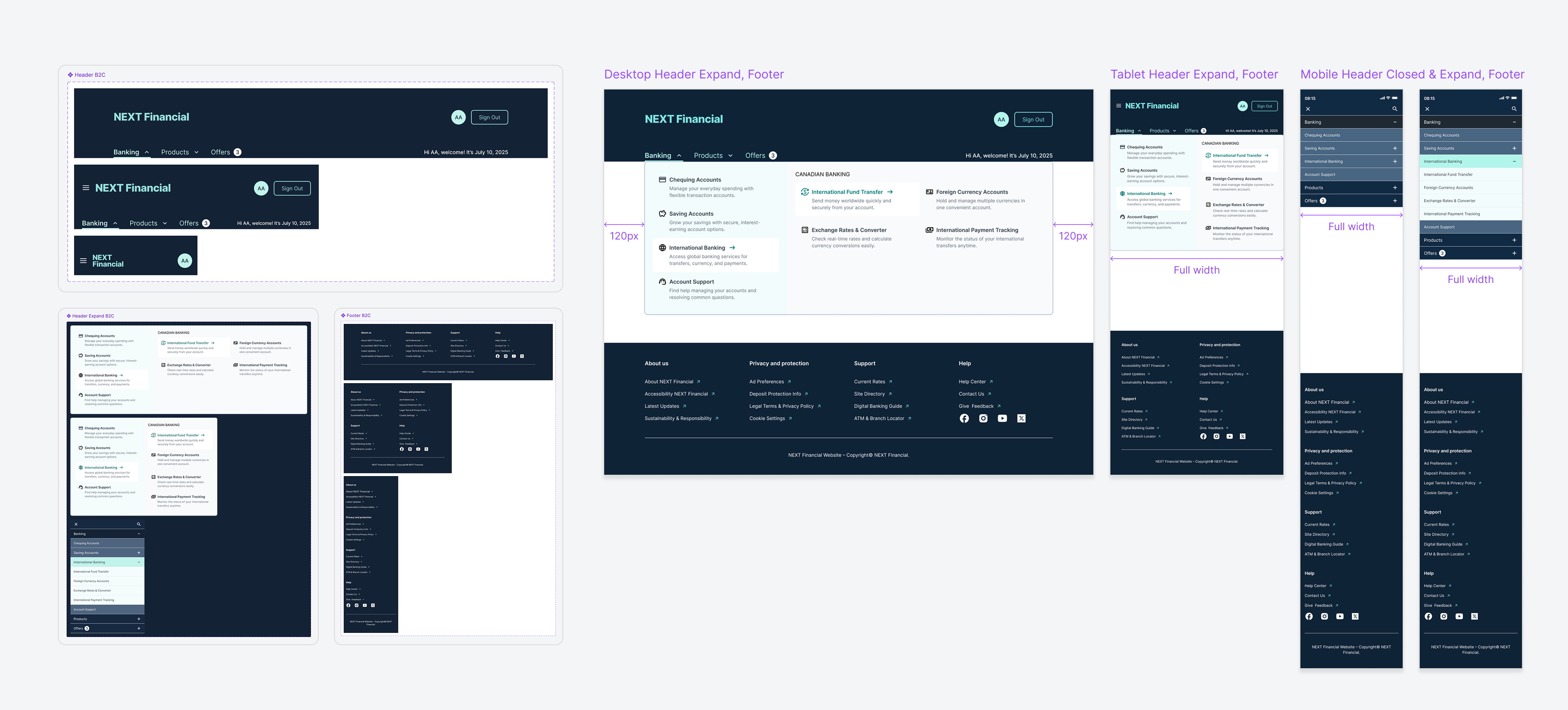
Header & Footer
The header and footer are designed as consistent navigational anchors across all screen sizes, ensuring accessibility, clarity, and ease of use in both desktop and mobile contexts.
Header
Responsive navigation with dropdown menus for Banking, Products, and Offers. Includes quick access to account profile, sign-out, and personalized welcome message. Desktop features a mega menu; tablet and mobile use expandable menus.
Footer
Site-wide navigation organised into four categories: About Us, Privacy and Protection, Support, and Help. Provides direct access to legal policies, contact support, account information, and social media links.
Component
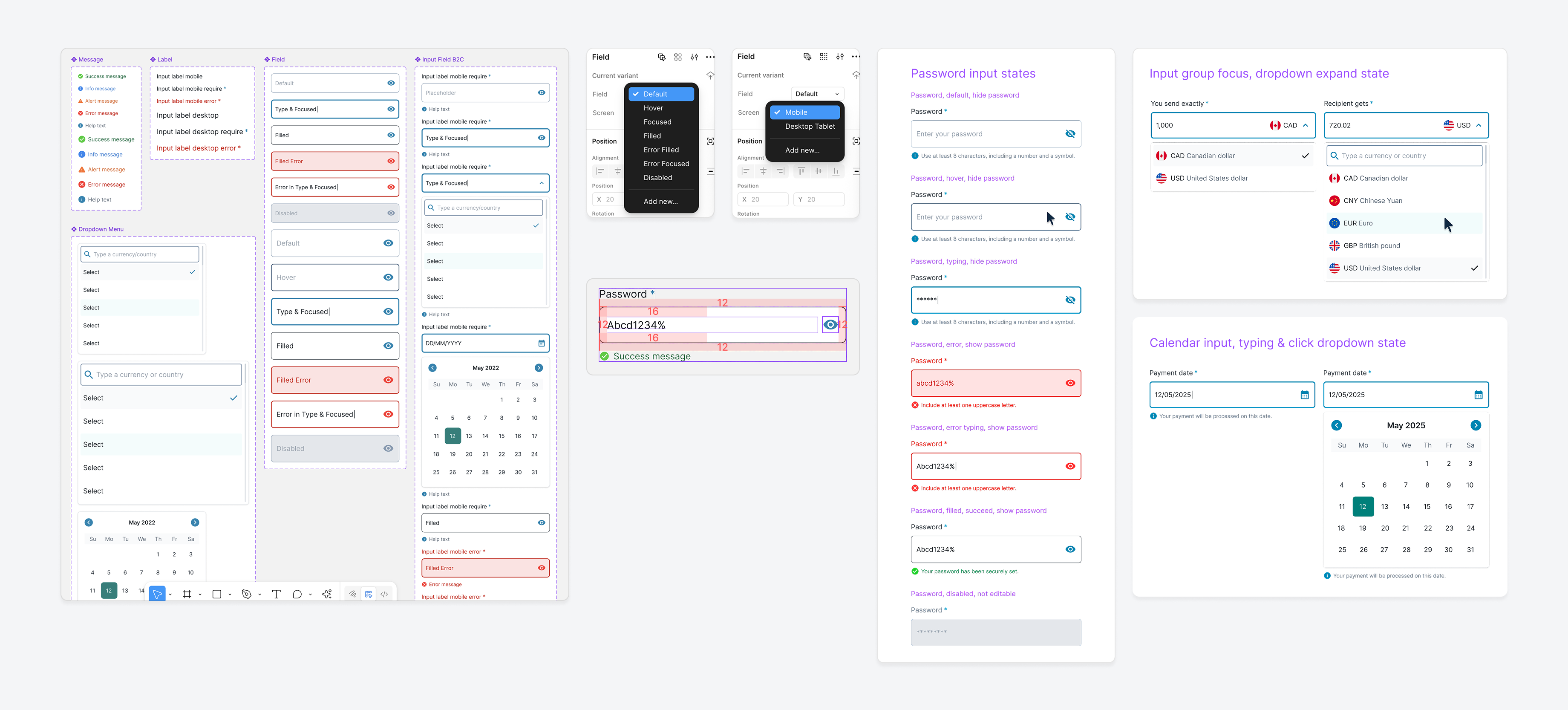
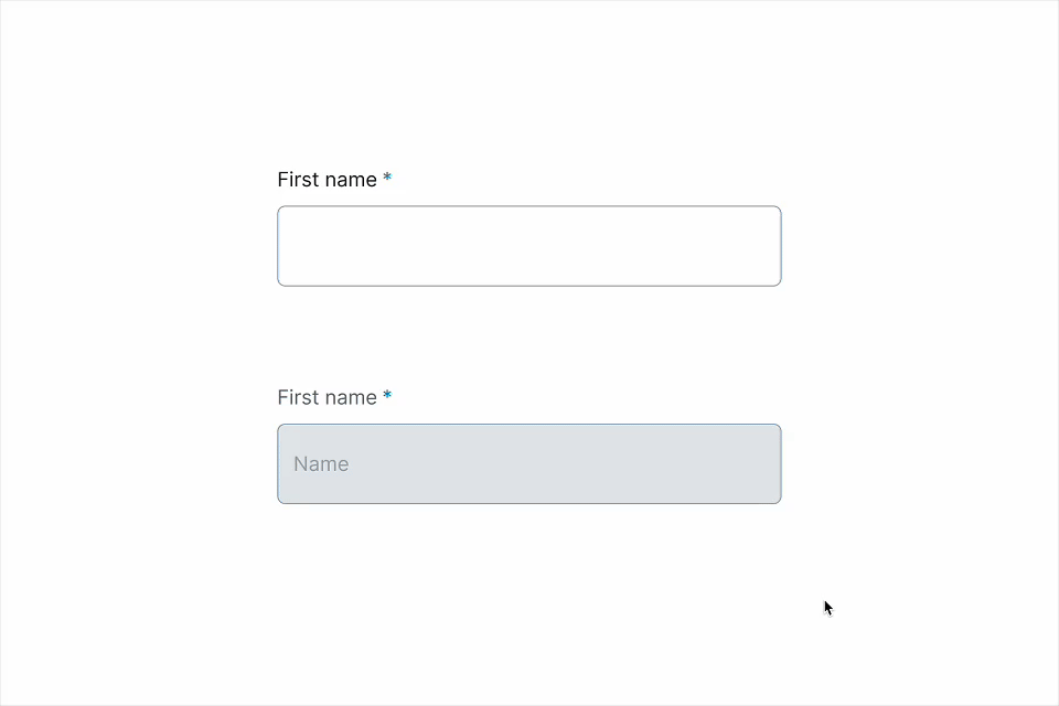
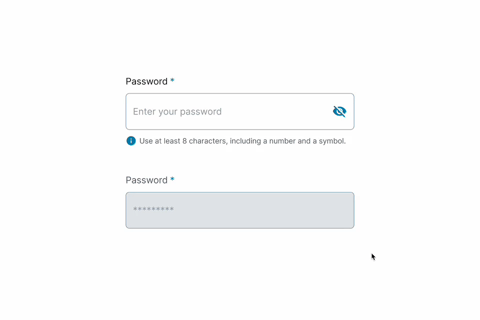
Input Fields
The input library includes a range of field types designed for clarity, consistency, and accessibility across devices. Text fields handle short freeform entries. Password fields provide secure input with strength validation and toggle visibility. Comments fields support multiline input with character limits. Grouped inputs pair related fields such as amount and currency selectors.
Dropdown components include single-select lists with search, placeholders, and validation. Date pickers enable both calendar selection and manual entry. All components follow consistent interaction states: default, hover, focus, filled, and error.
Text
A text field is an input field that merchants can type into.
Password
A secure input field that hides characters by default and validates password strength as the user types.
Comments
A multiline text area for users to leave feedback, reviews, or open-ended input, with support for character limits and validation.
Group
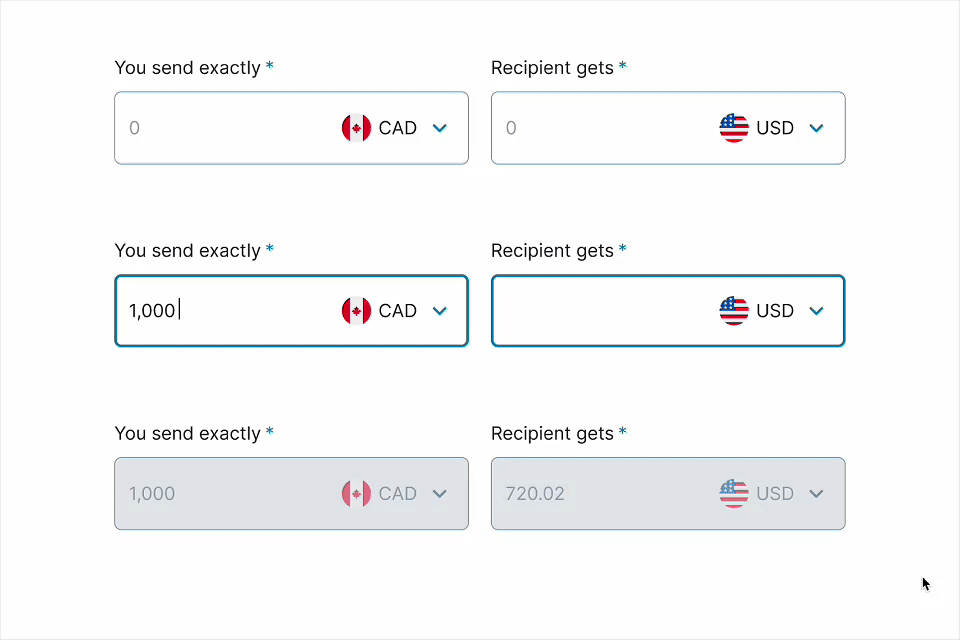
A grouped input field that combines amount and currency selectors to support multi-field entries like money transfers.
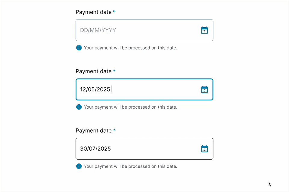
Date Picker
An input field that lets users select a date using a calendar or by typing in a specific format.
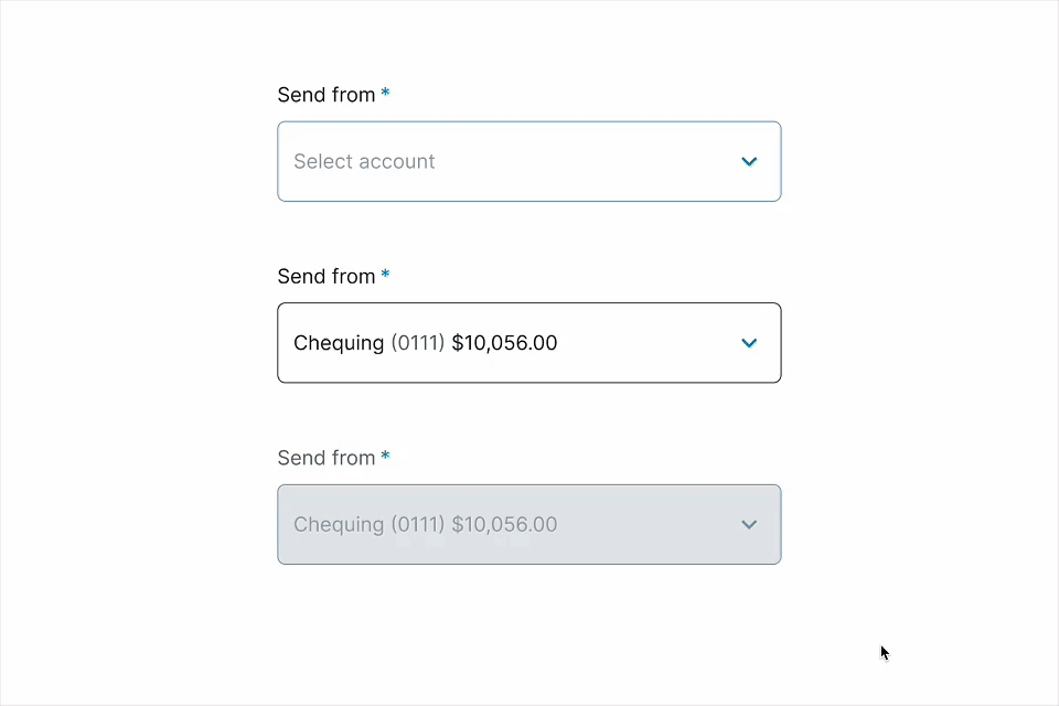
Dropdown
A select input that lets users choose one option from a predefined list, with support for placeholders, validation, and disabled states.
Component
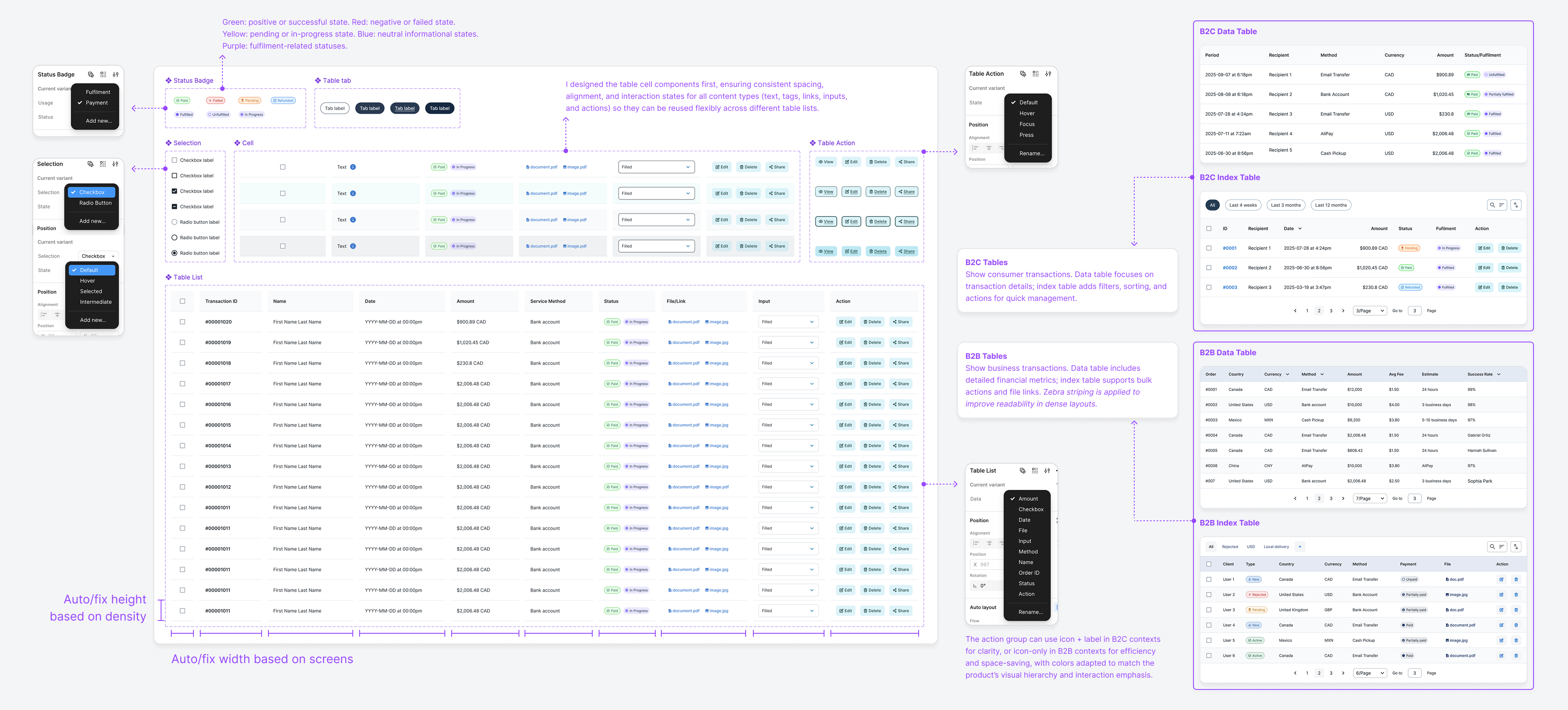
Table, Selectors, Filters
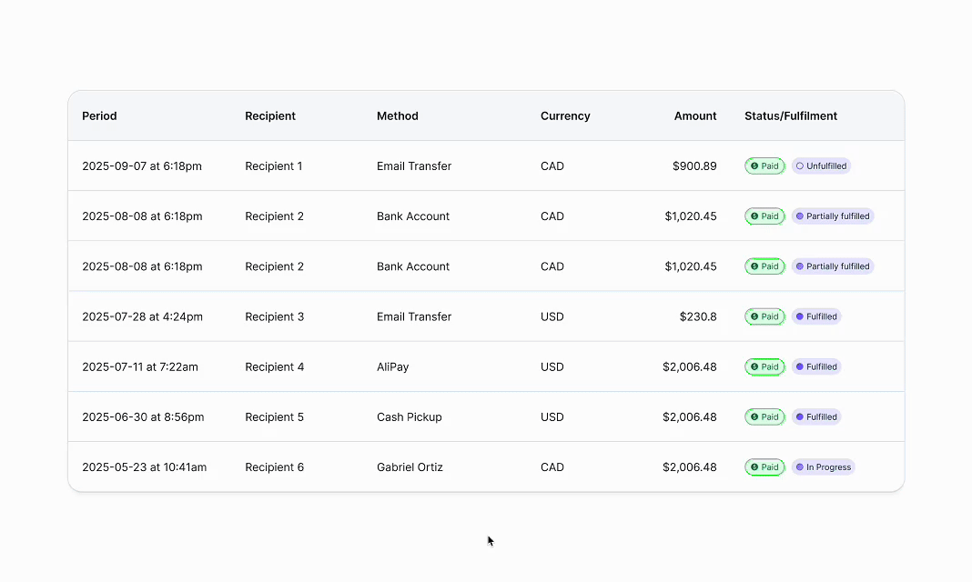
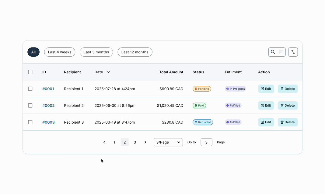
The table system covers both B2C and B2B use cases, with responsive layouts, consistent spacing, and full accessibility support. Cell components (text, tags, links, inputs, and actions) are reusable across contexts.
B2C Tables (Data/Index)
Designed for presenting essential information in a clear, scannable format, with index tables adding filtering, sorting, and quick actions.
B2B Tables (Data/Index)
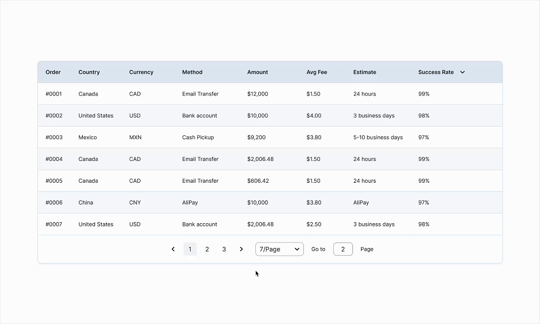
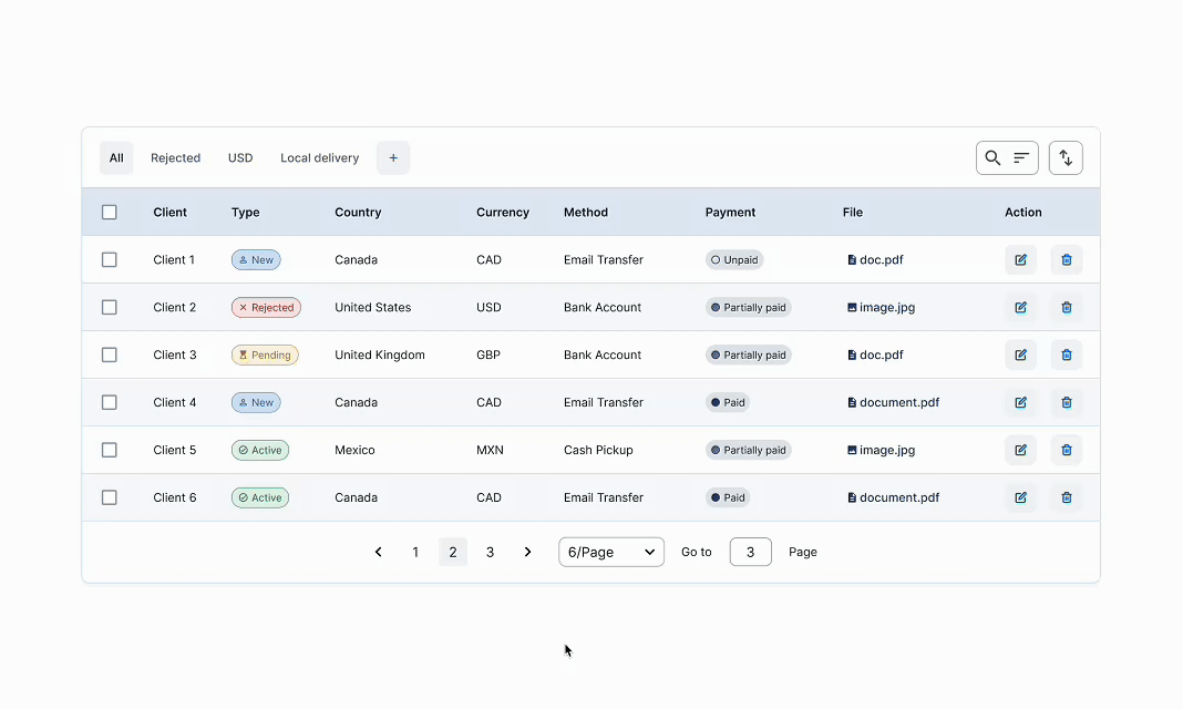
Optimized for displaying large, detailed datasets with support for bulk actions and file links. Zebra striping is applied to enhance readability in dense or data-heavy layouts.
Action Groups
Configurable as icon + label for clarity (B2C) or icon-only for efficiency (B2B), with colours adapted to match visual hierarchy and emphasize key interactions.
Adaptive Layout
Auto-adjusts row height based on density and column width based on screen size, ensuring usability across devices. On smaller screens, tables display only key information, with rows clickable to reveal full details.
Use Cases
B2C Data Table
Presents users' transfer records for easy comparison and tracking, focusing on readable details and clear status/fulfilment indicators.
B2C Index Table
Enables users to search, filter, and take quick actions on individual transfers with prominent status tags and action buttons.
B2B Data Table
Gives operations teams transaction metrics, sortable columns, and performance indicators for analysis and decision-making.
B2B Index Table
Supports admin workflows with powerful filtering, compact row actions, and status tracking to manage multiple clients or records efficiently.
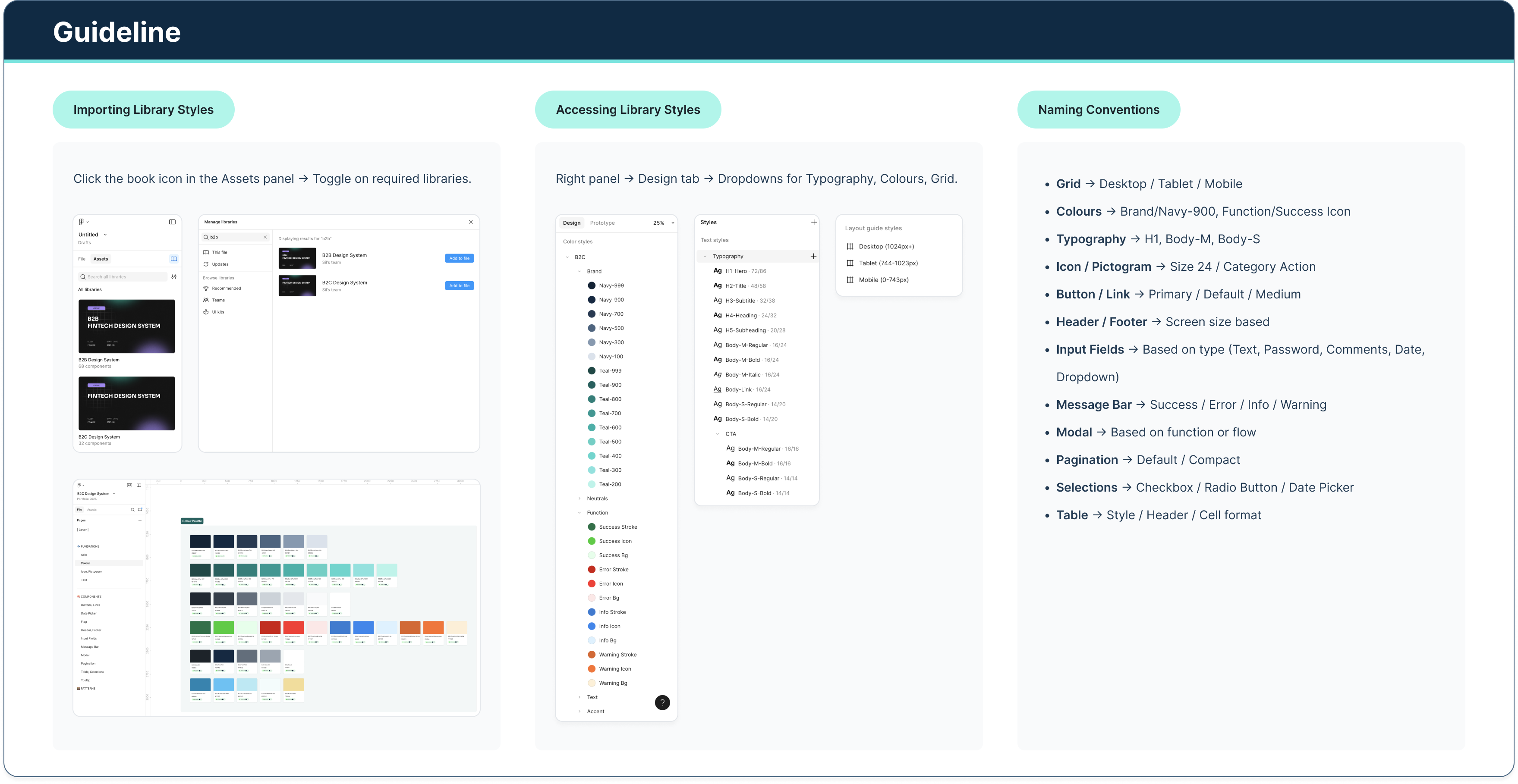
Guideline
Documenting & Informing
Building the system was only half the work. The harder problem was driving adoption across teams that had developed their own patterns over time and had no existing reason to change.
I structured adoption in two layers. The first was asynchronous: I embedded documentation directly within Figma, including component notes, usage guidelines, and walkthroughs for complex flows, so teams could onboard without waiting for a meeting. Each new component release was linked to relevant production screens, giving developers a single source of truth during handoff.
The second layer was active: I ran regular working sessions with product teams across all five product lines (GMT, ISP, ISBO, COR, and RBA) to walk through components in the context of their actual work, gather feedback, and fold edge cases back into the system. This kept the library grounded in real usage rather than theoretical coverage.
The result was a system that teams chose to use, not one they were handed. Reducing redundant work and inconsistent patterns across products was the measurable outcome; building the habit of shared ownership was the longer-term one.